Captain Morgan
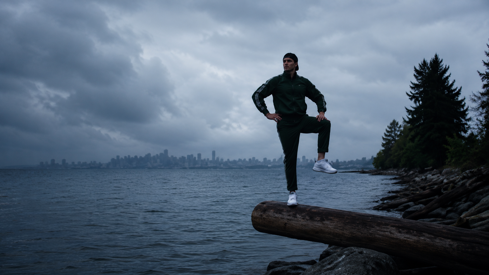
Got a Little Captain in You" campaign and an online contest created a ton of content to get 16 year-old boys excited to drink rum and coke. So excited, in fact, Captain Morgan took it a step further and responsibly put the drink in a can.
:30 TV, The Four Guys
:15 TV, Captain in a Can
:30 TV, Text Message
:30 TV, Captain Pose off contest launch
Activation for fans to submit their own captian poses for a chance to win a massive prize.
AIR SUPPLIES
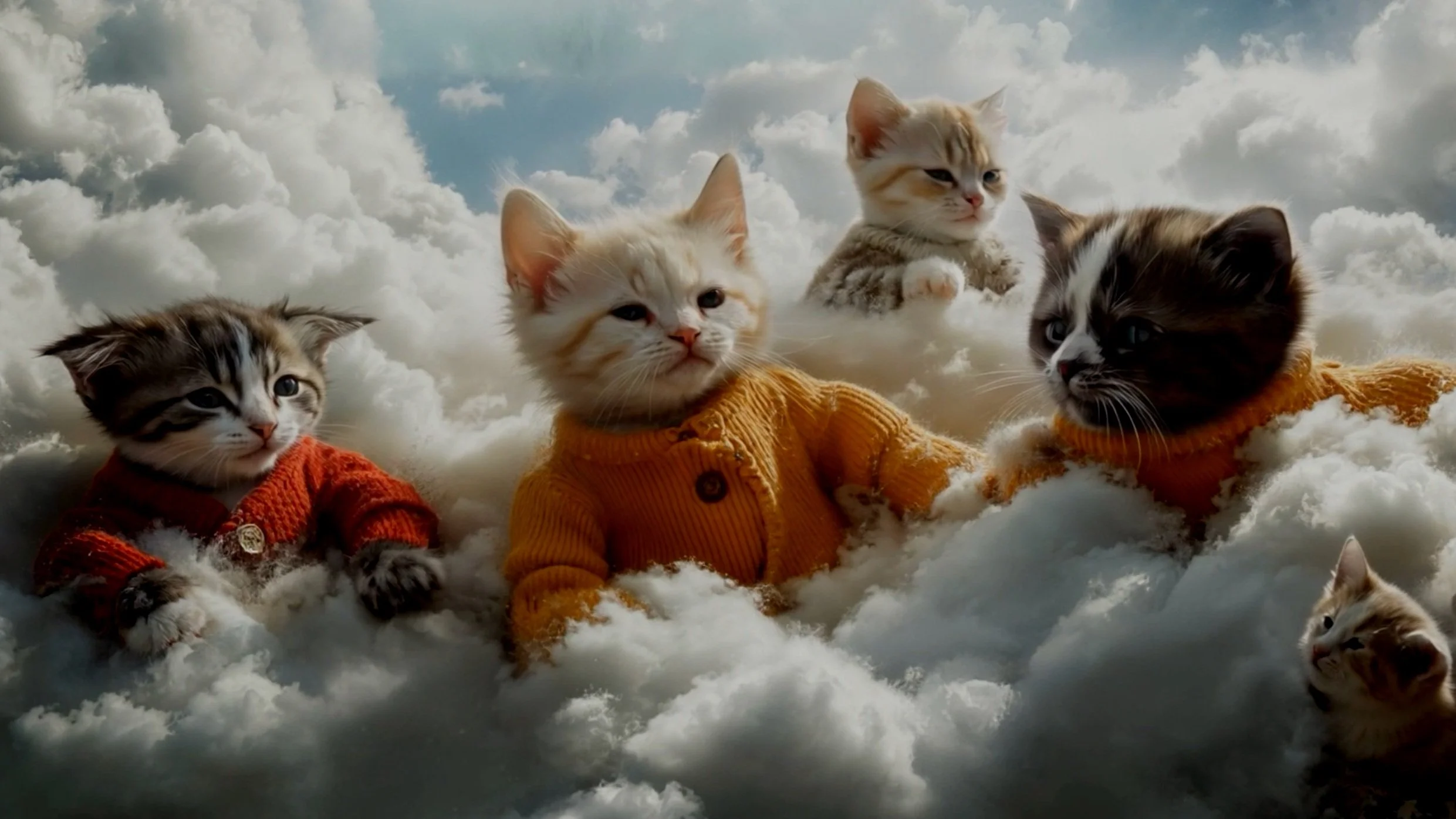
A series of rapid-launch ad campaigns built to test product virality in the real world. Each concept ran with paid media, a dedicated website, and live audience engagement, turning the campaigns into digital focus groups. The top-performing product will move into official launch this September.
The debut campaign, Softer Than, introduced an ultra-luxe slipper designed around pure comfort.
Total production time: 5 hours
'Crème Yourself'—a playful, tongue-in-cheek campaign to introduce Air Supply’s premium body lotion in style.
Total Production Time: 12 hours
Finally, our ad for Air Supply’s Mousing Hand Soap—luxuriously soft, like washing with clouds.
Total Production Time: 8 hours
PEPTOCOPTER
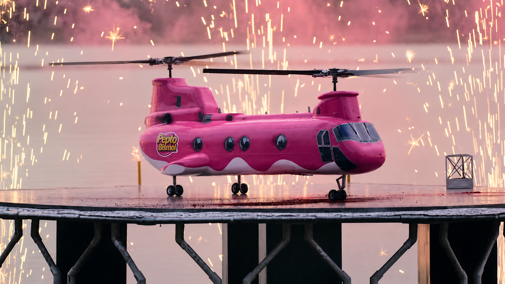
Pepto-Copter was a digital campaign for Pepto-Bismol To-Go, built around a simple idea: relief can find you anywhere. In the hero film, a tiny pink copter drops pocket-sized Pepto tabs to overindulged travelers, turning stomach trouble into a surreal rescue mission.
CLIO Silver. Rival IQ ranked Symptom Traveler among the Top 5 Most Branded YouTube Videos of All Time.
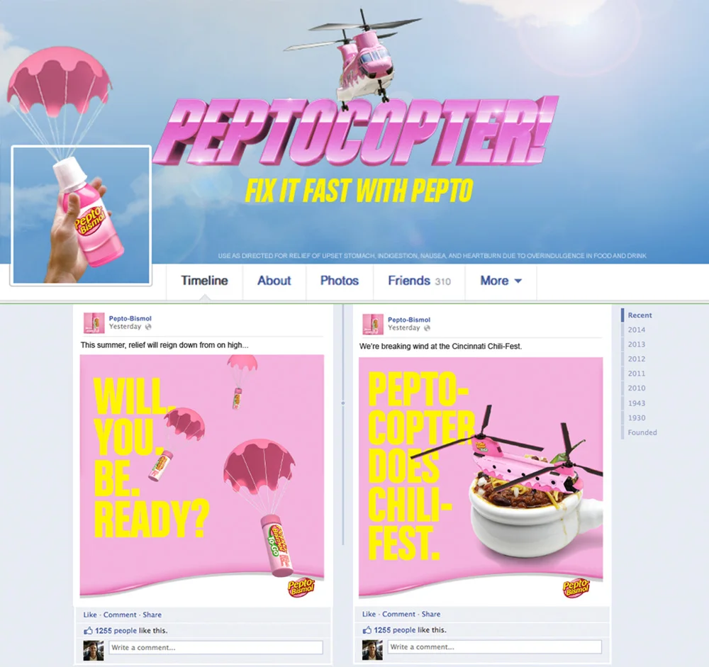
Peptocopter Cheeseballs
:15 Broadcast National Campaign
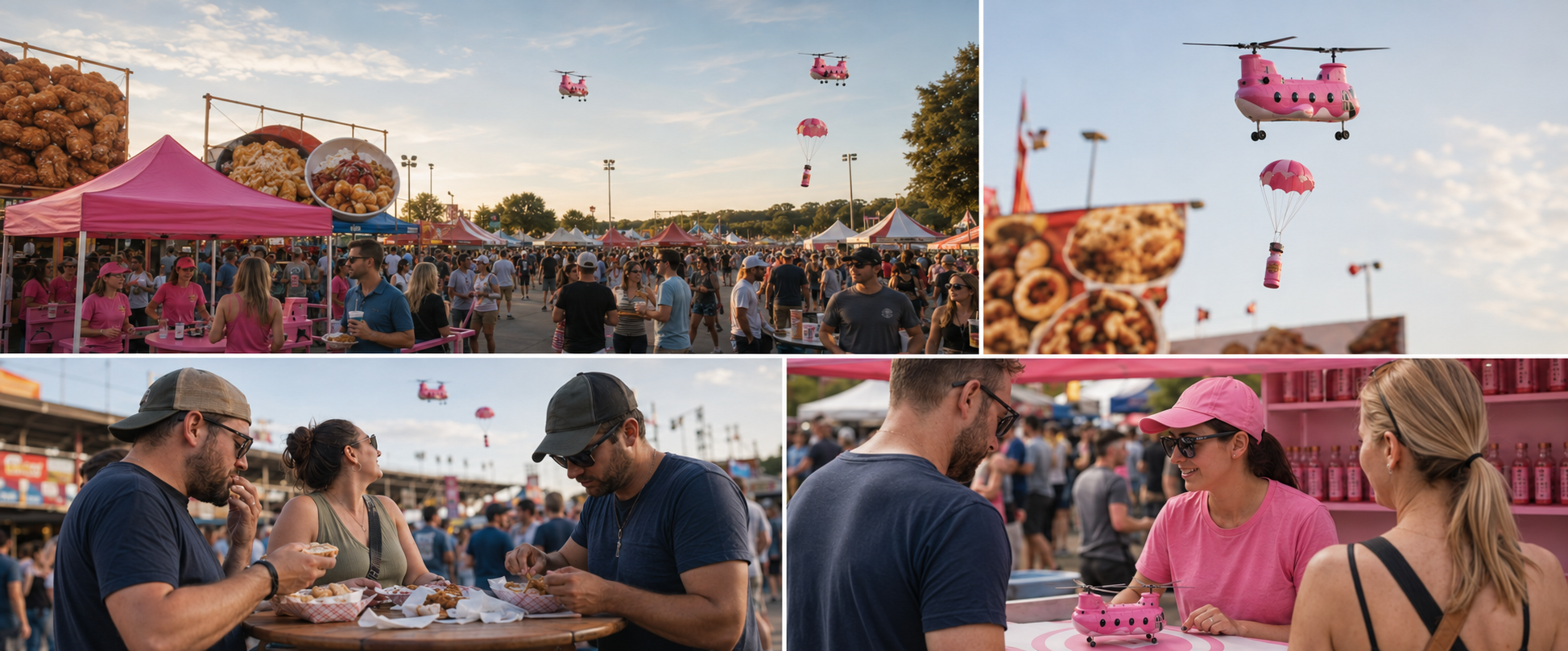
IRL Peptocopter Activation
Concept for SXSW food truck area activation
Peptocopter Quirky Turkey
:15 Broadcast National Campaign
LAYLIFE

2020-2022
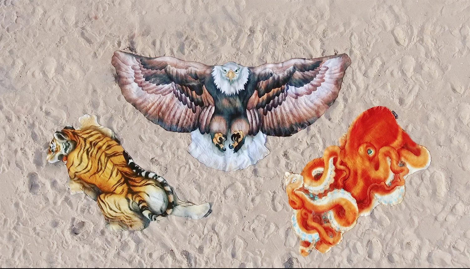
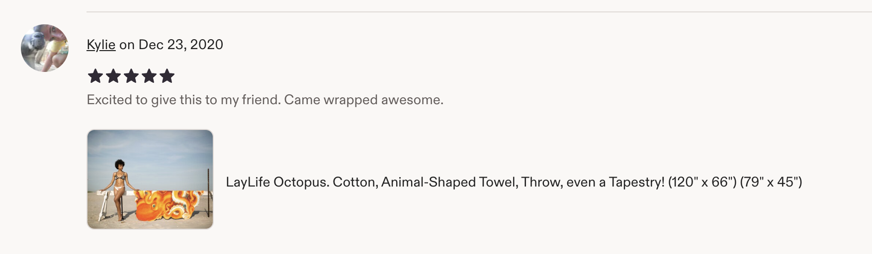
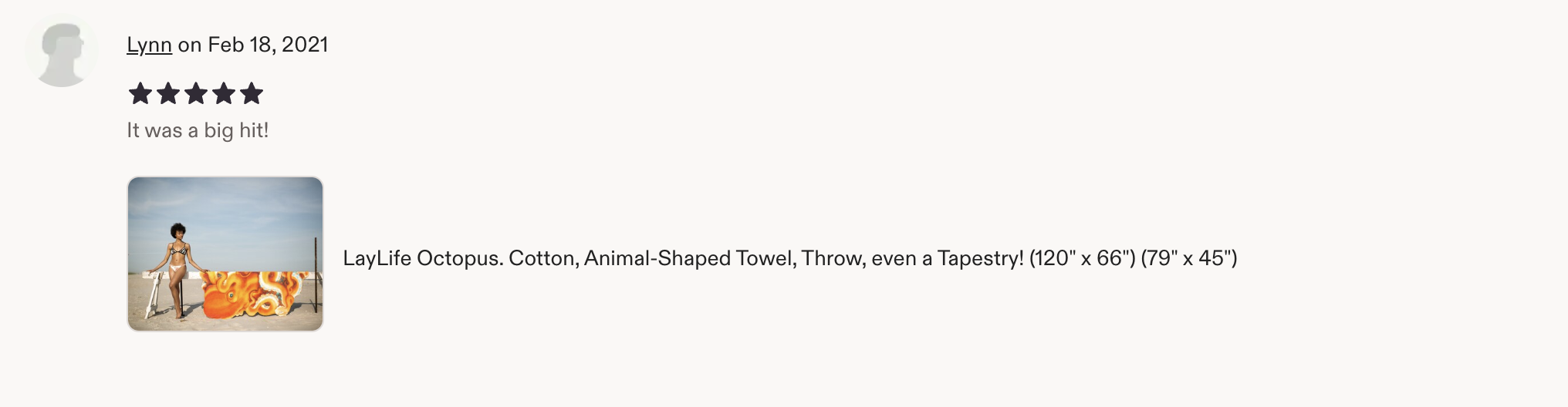
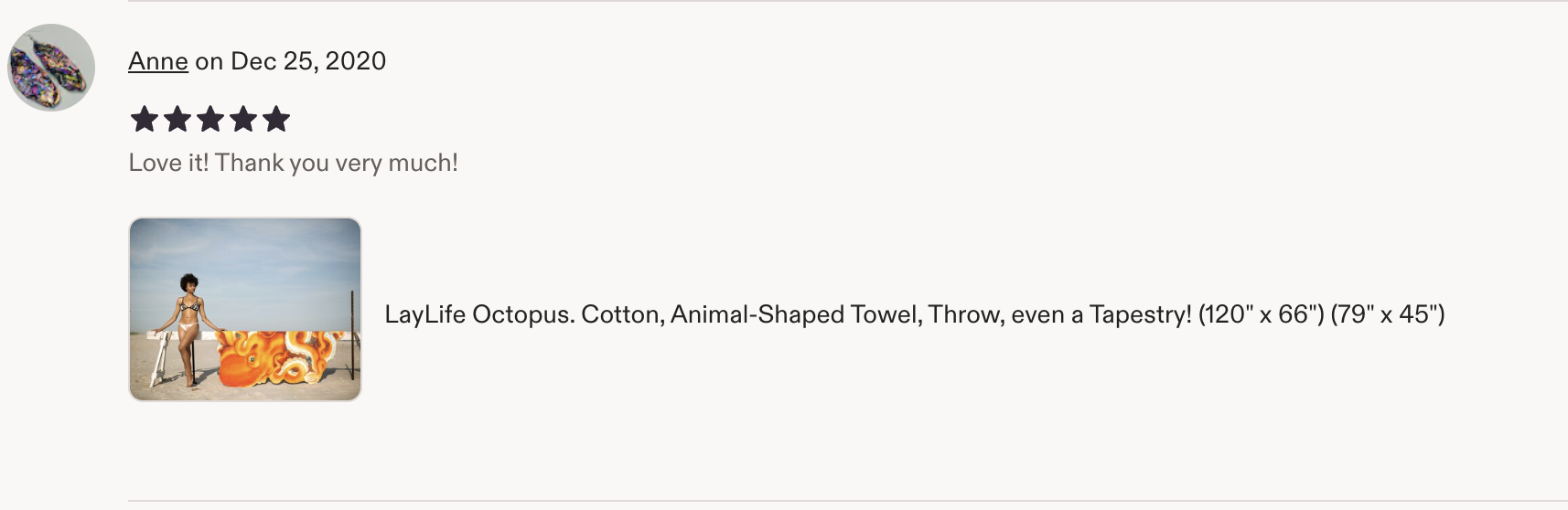
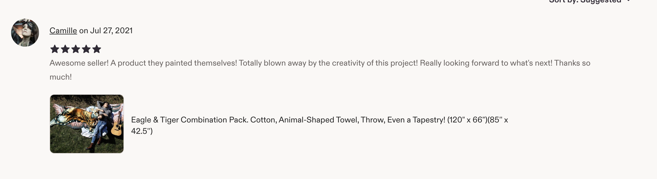
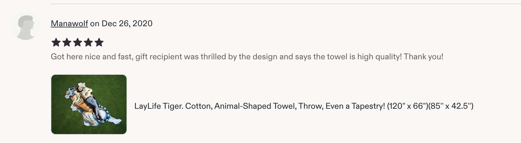
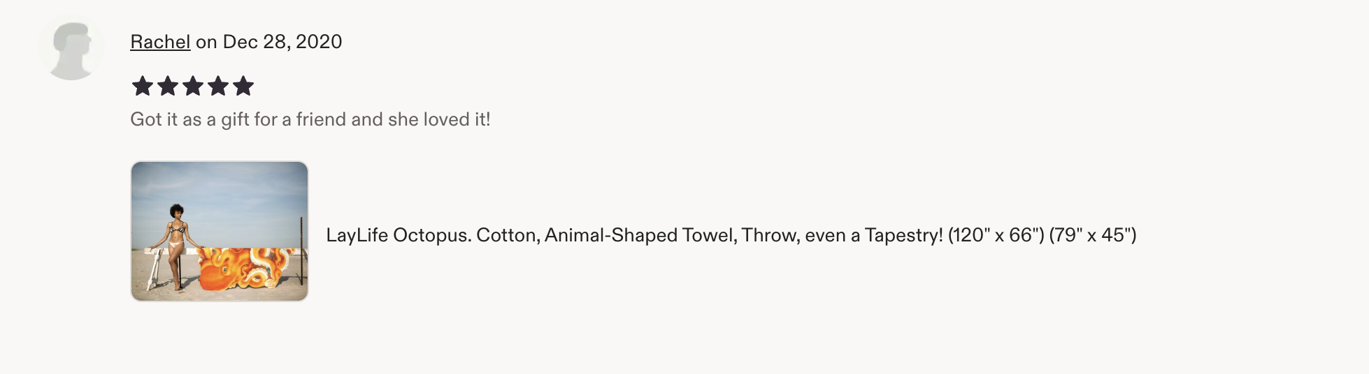
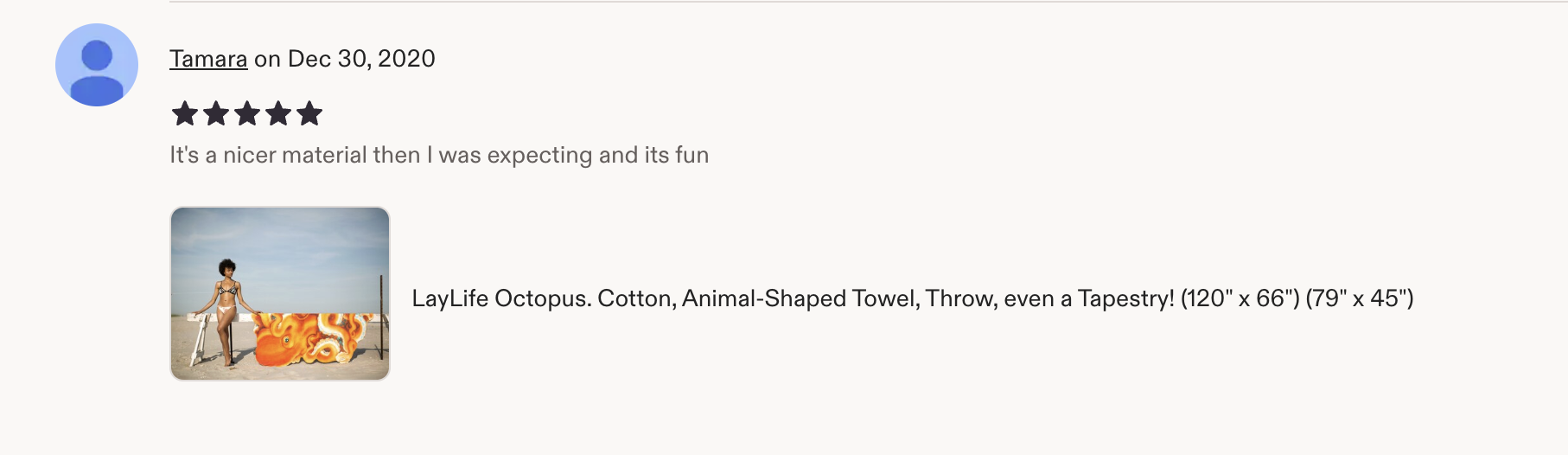
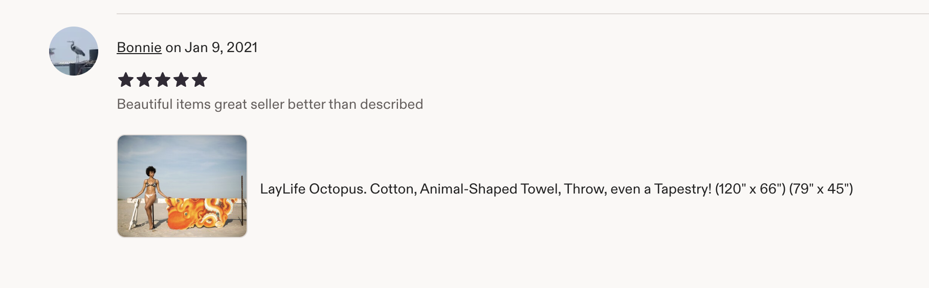
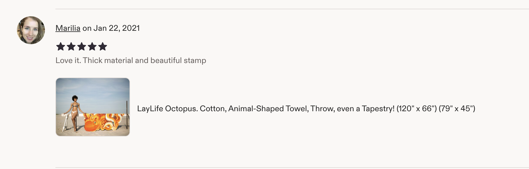
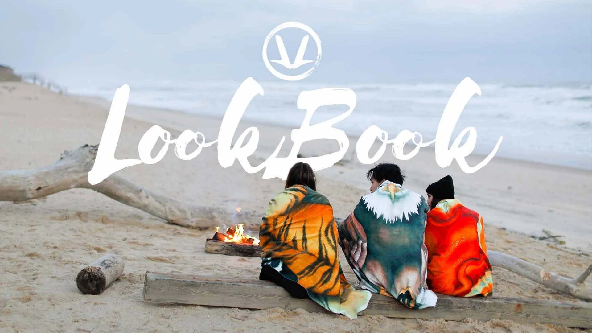
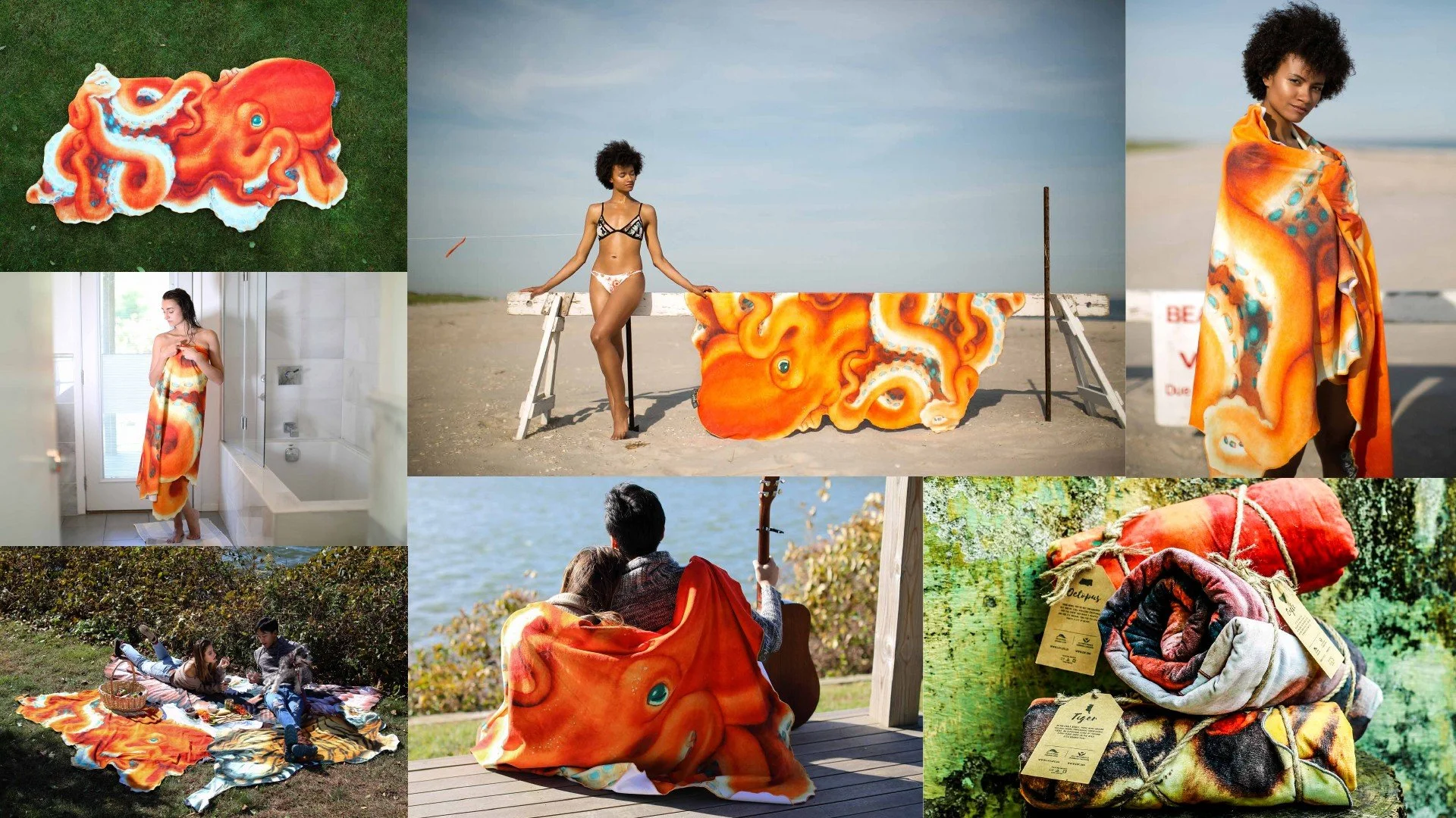
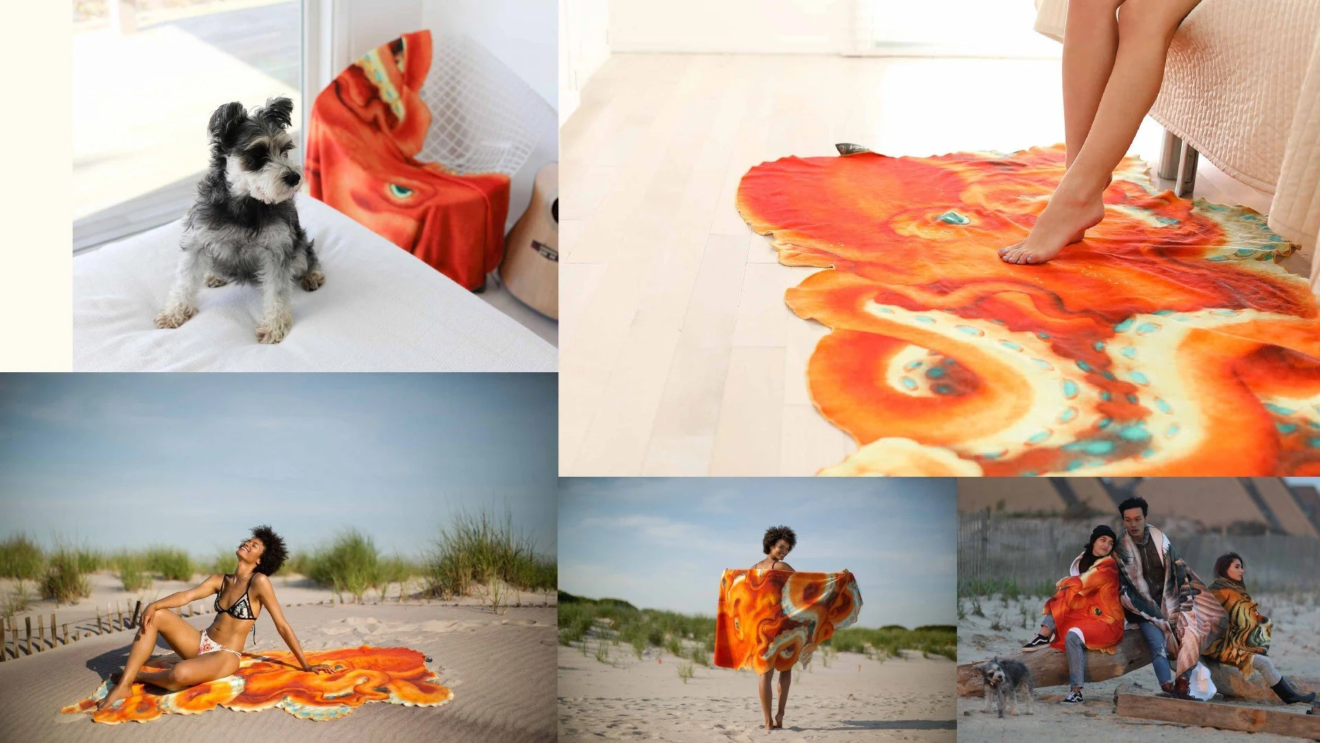
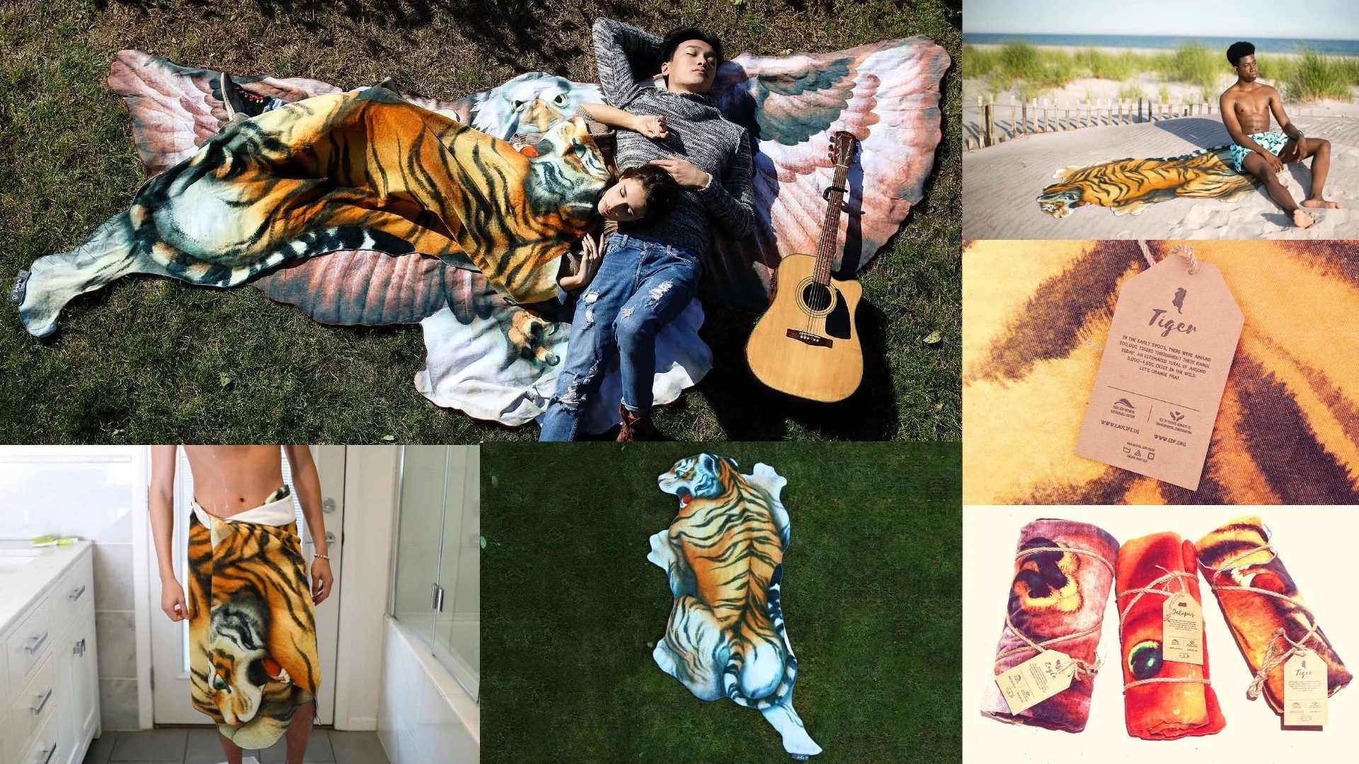
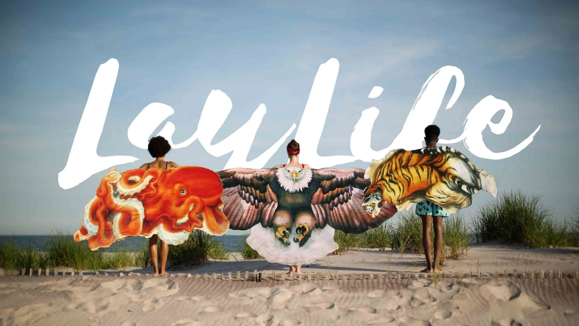
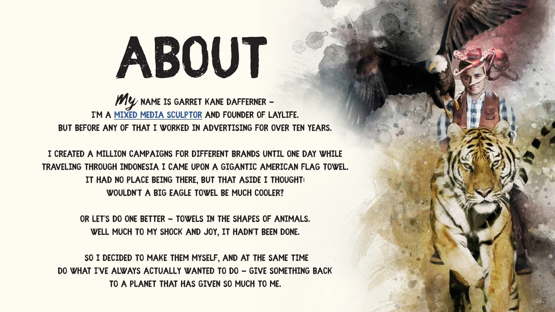
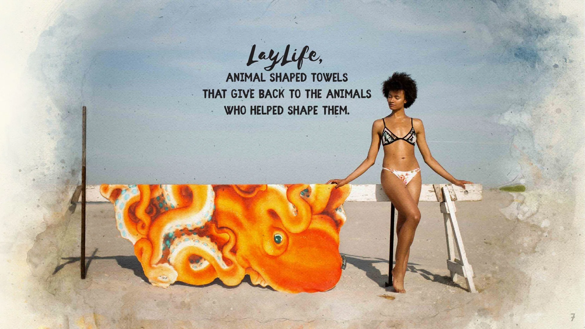
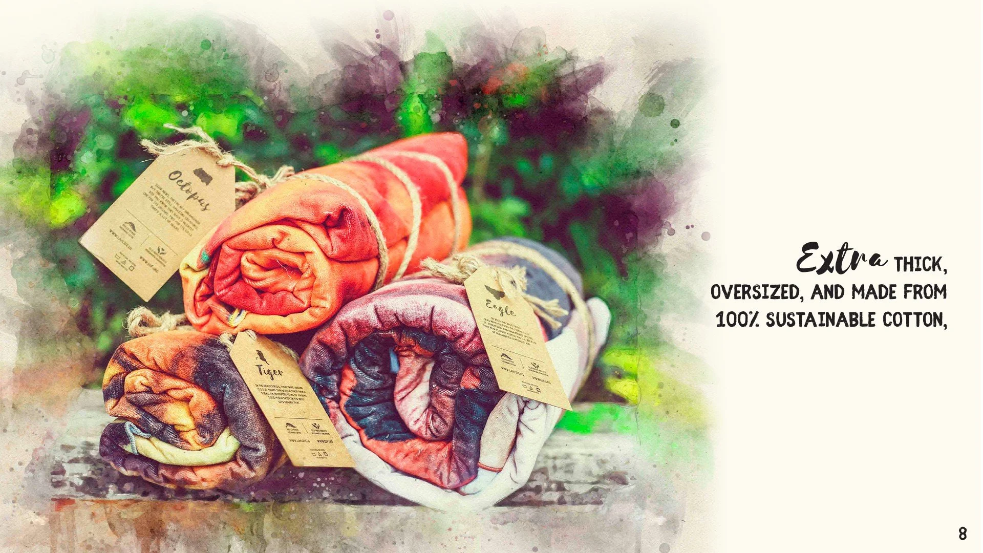
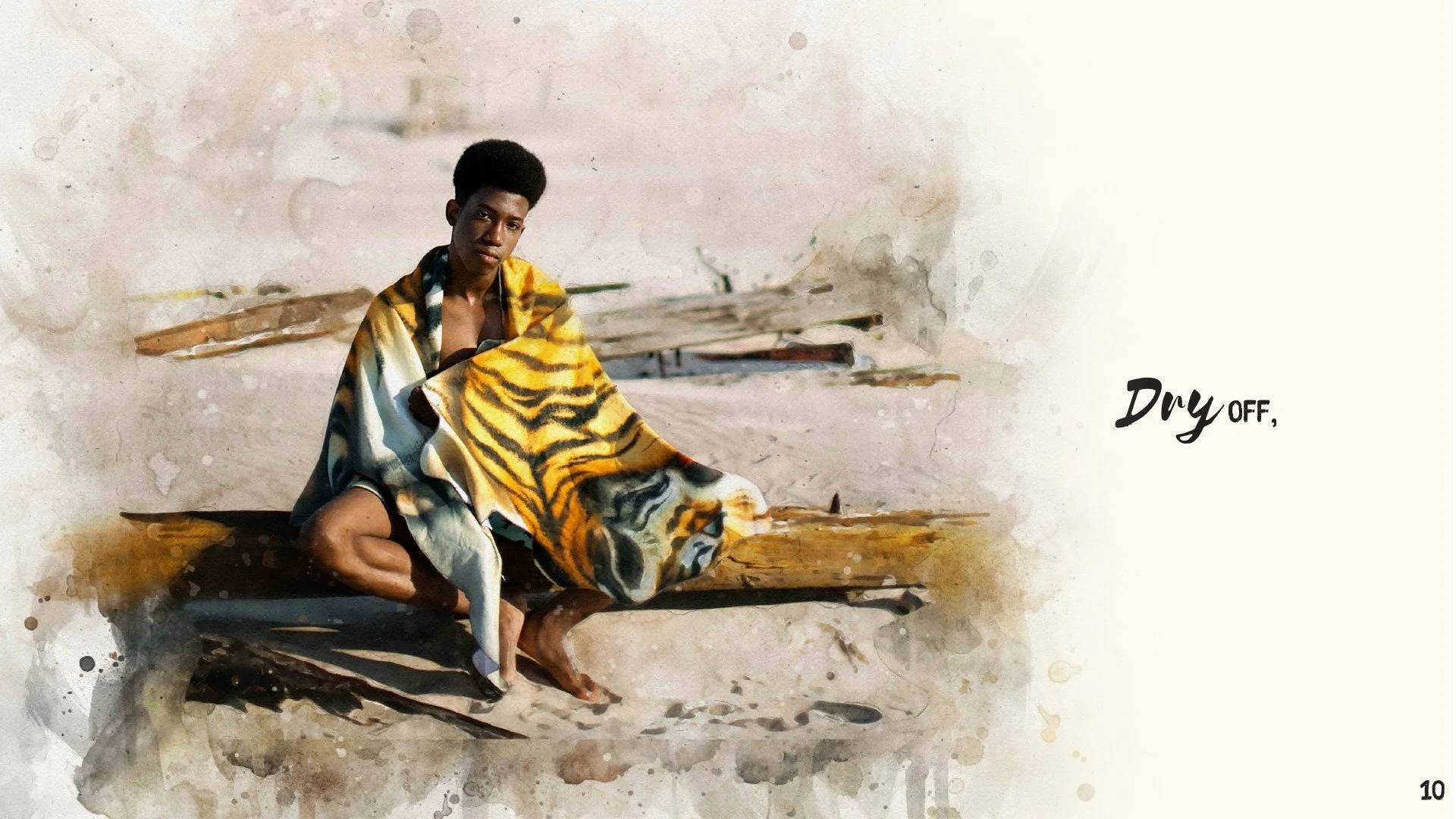
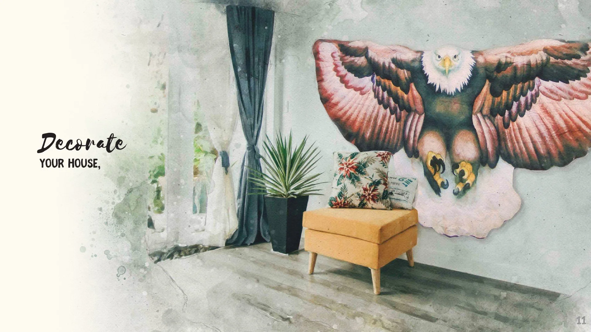
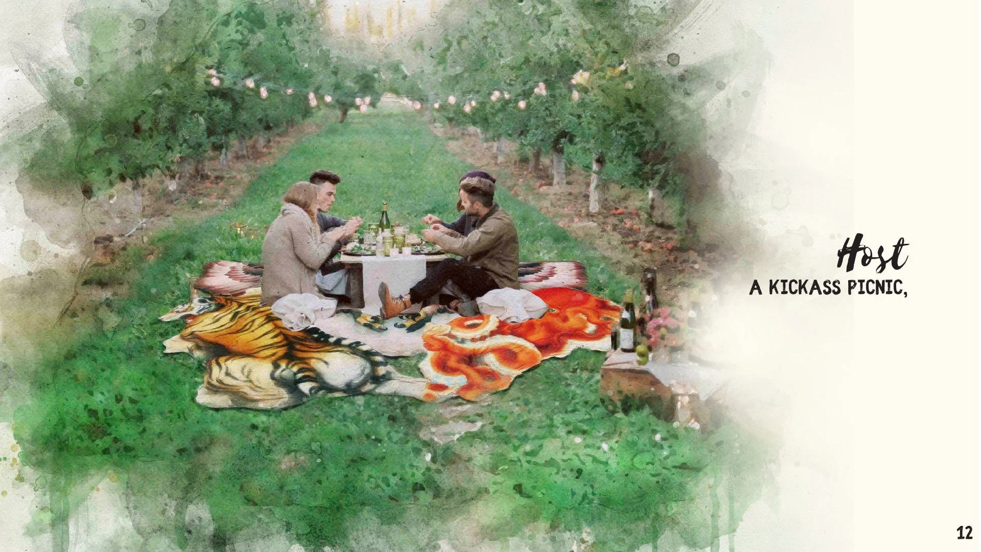
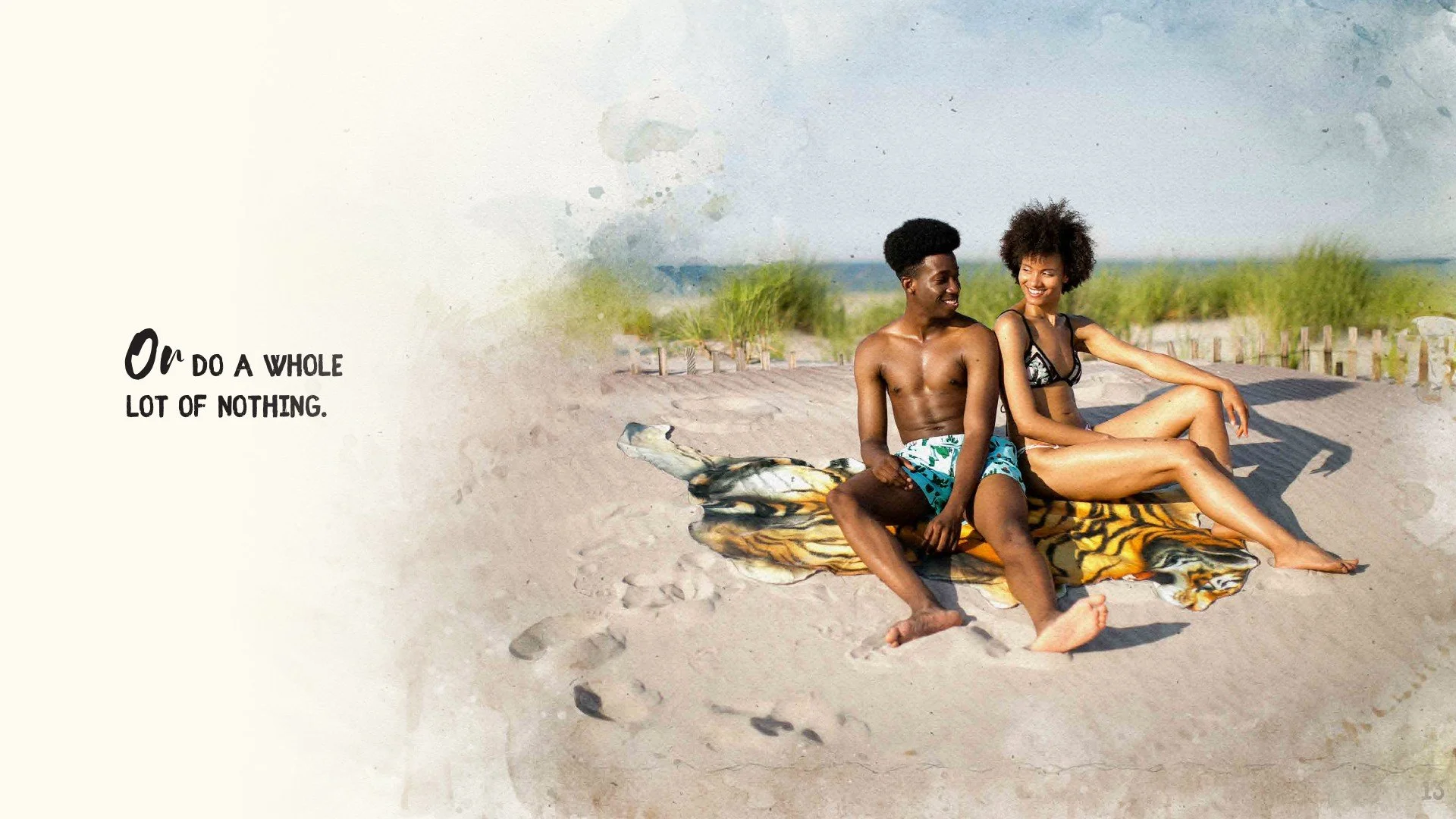
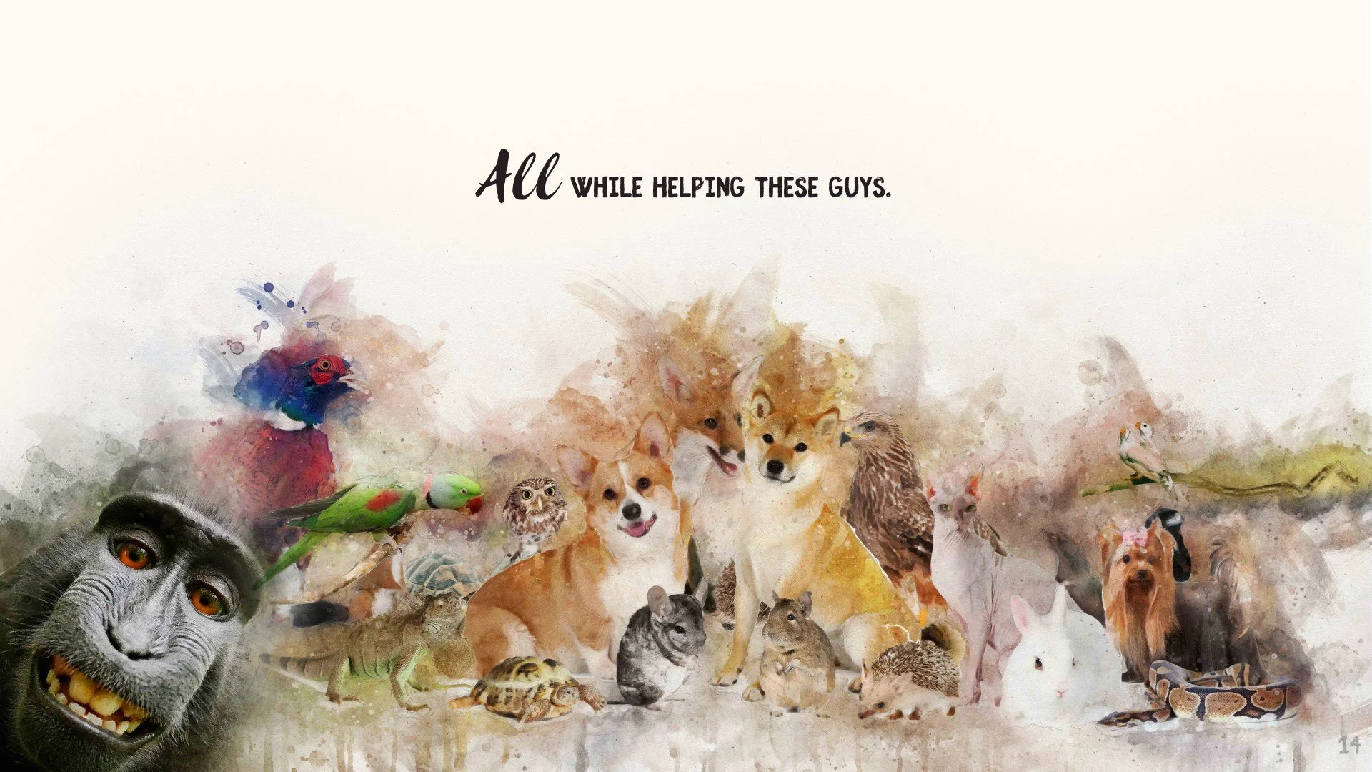
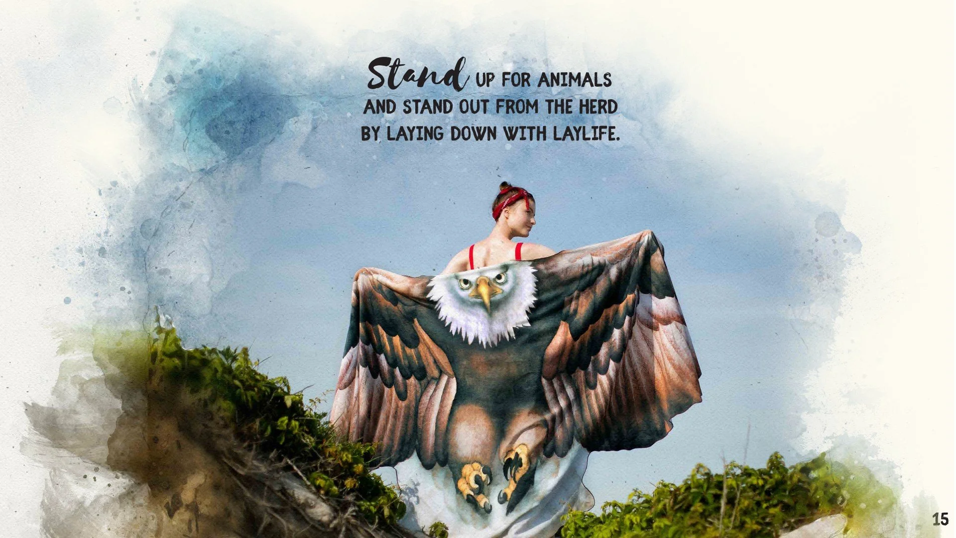
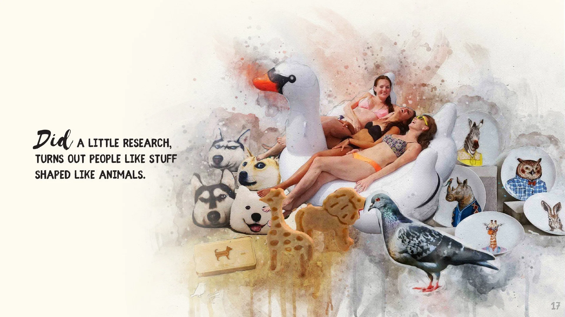
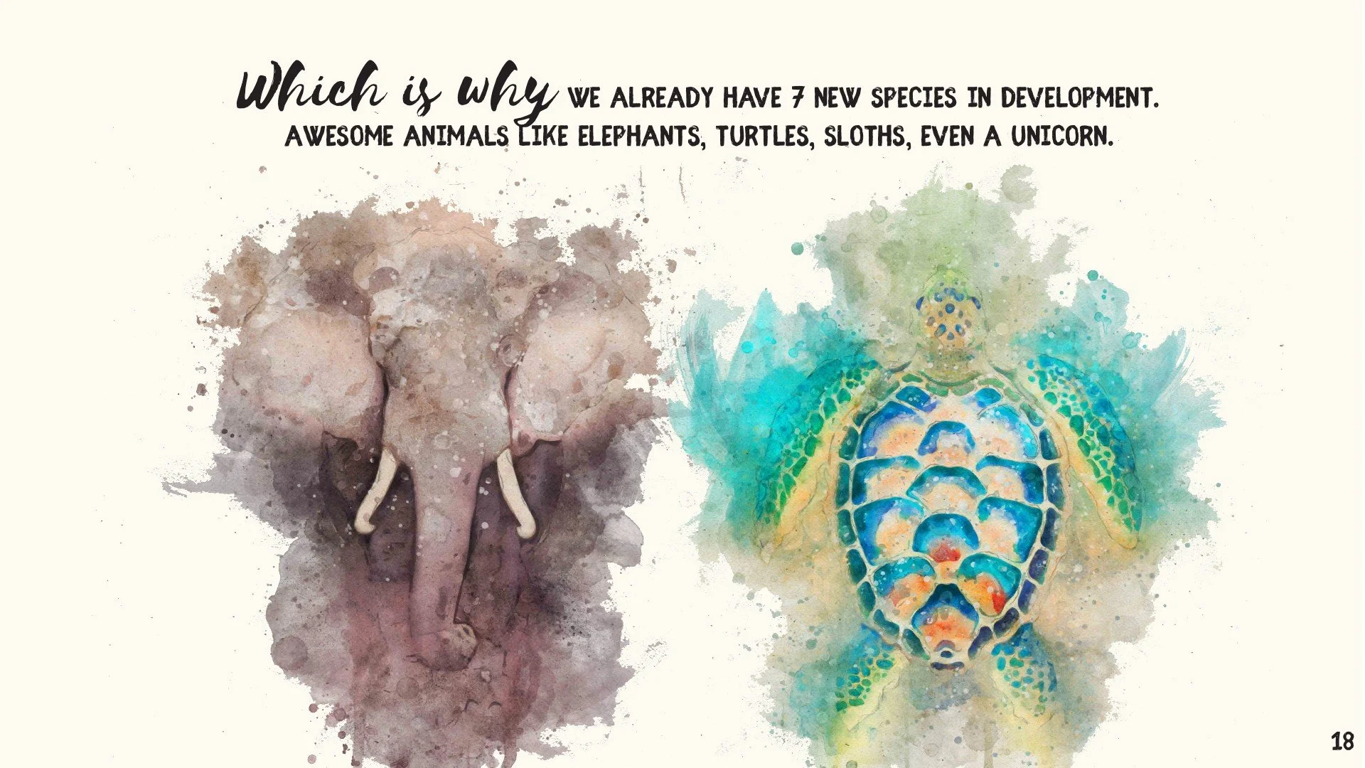
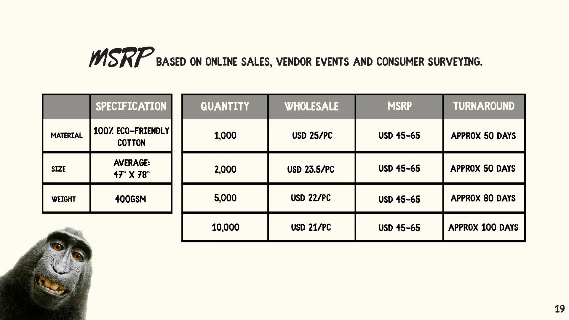
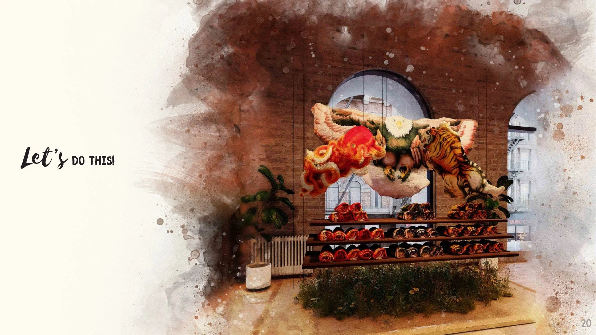
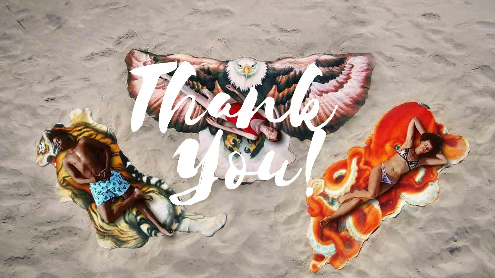
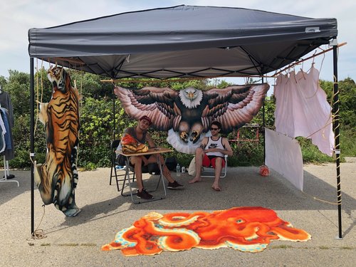
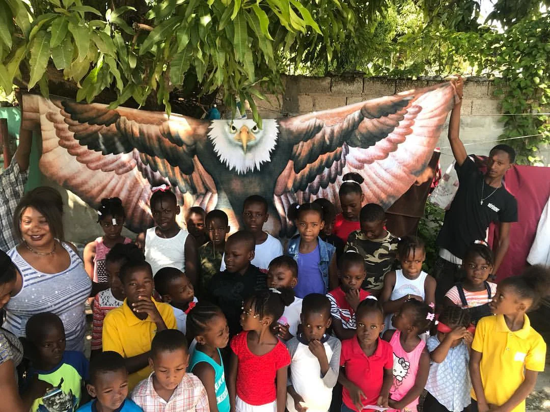
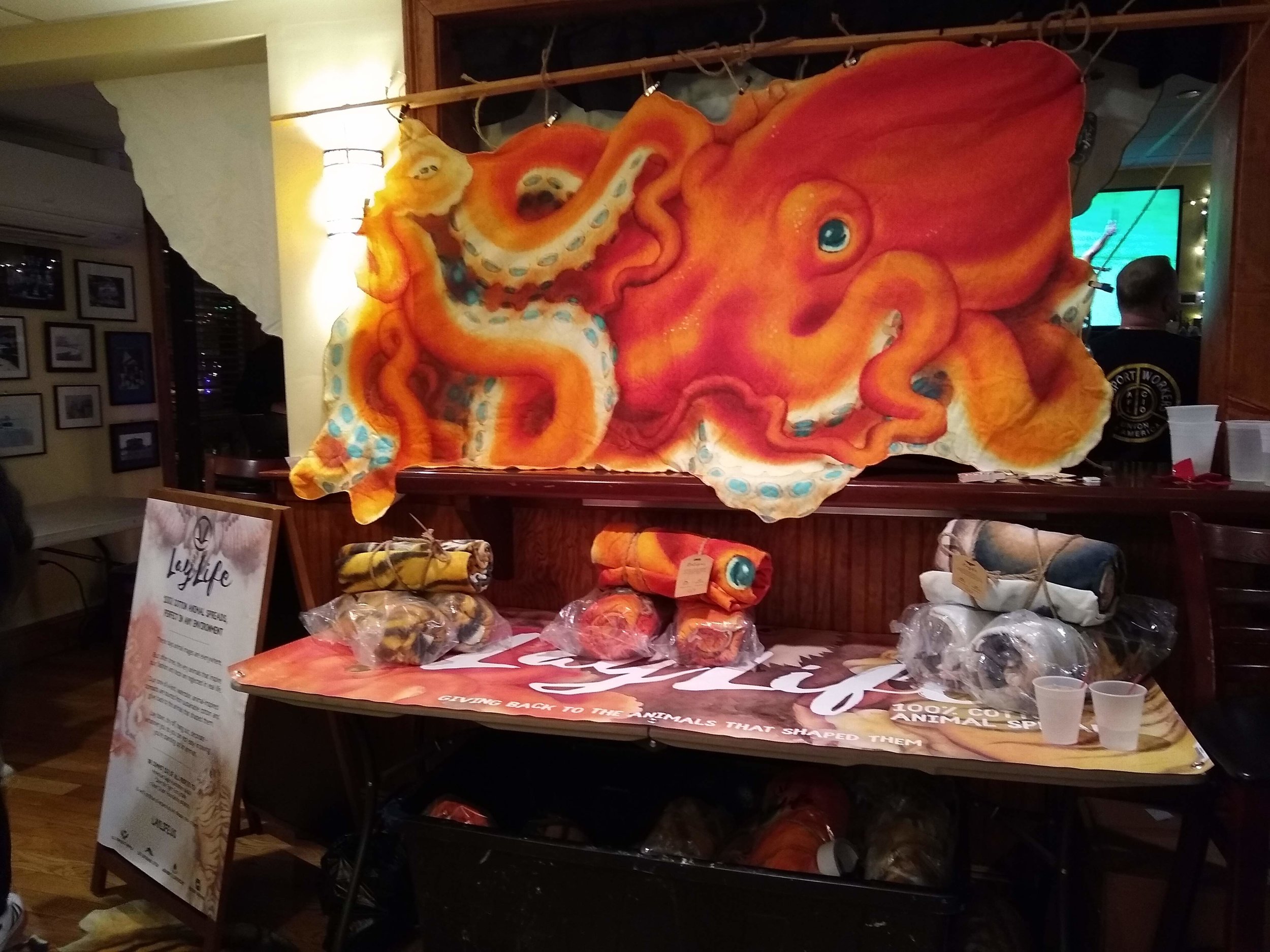
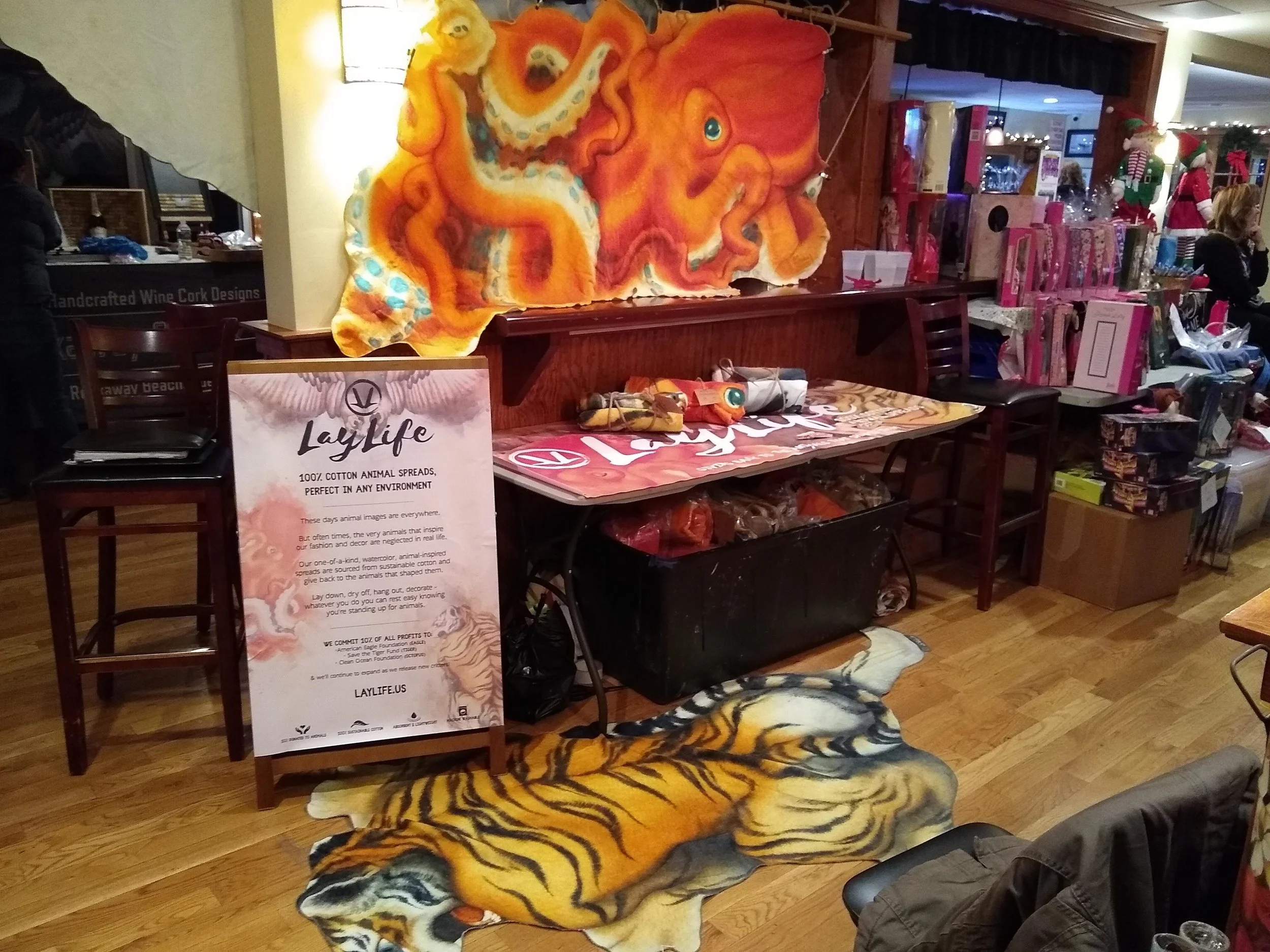
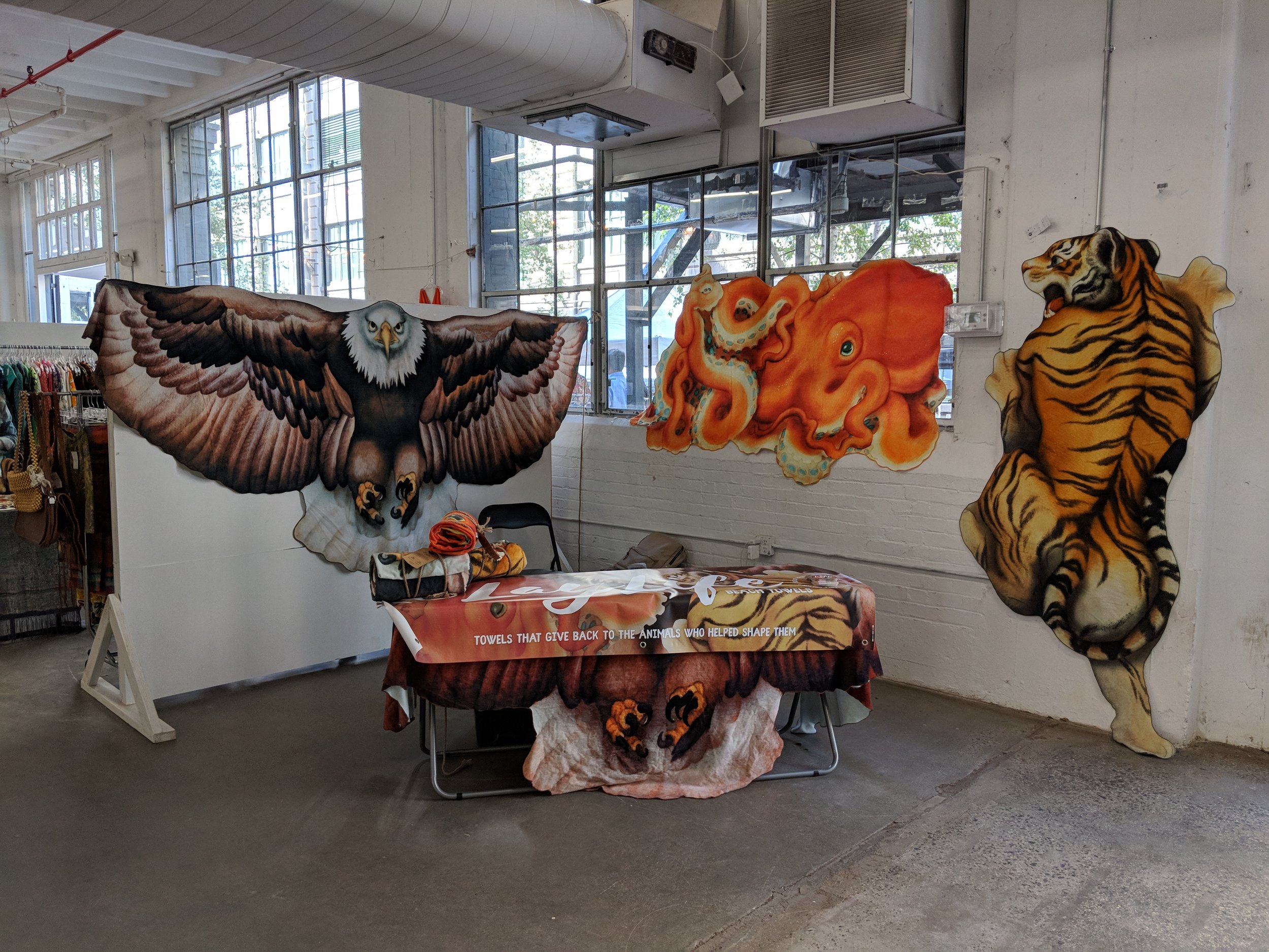
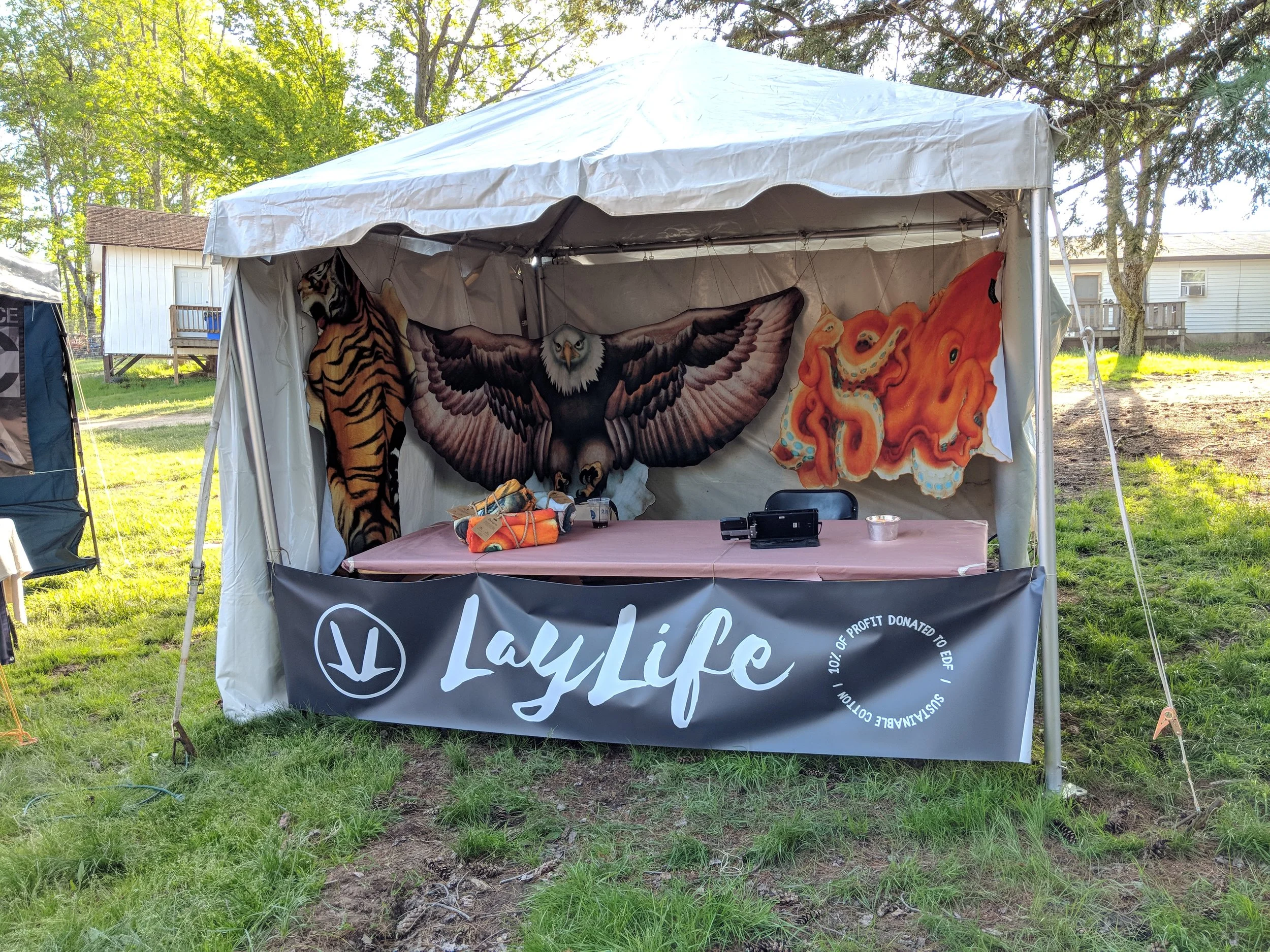
I founded LayLife to turn a basic everyday object — the beach towel — into something more sculptural, functional, and memorable while helping the animals that shaped them. The first collection featured oversized 100% cotton towels and spreads cut into animal silhouettes, beginning with the Tiger, Eagle, and Octopus.
I developed the concept, product line, branding, ecommerce presence, sourcing, and outreach myself. The initial run of 3,000 units sold out in under a year with zero paid advertising, driven entirely through Etsy, Amazon, cold outreach, and word of mouth.
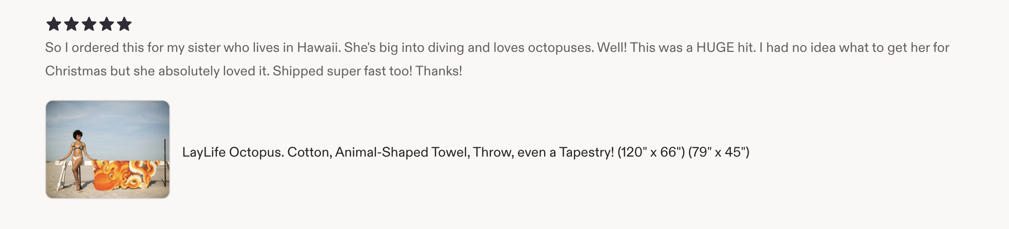
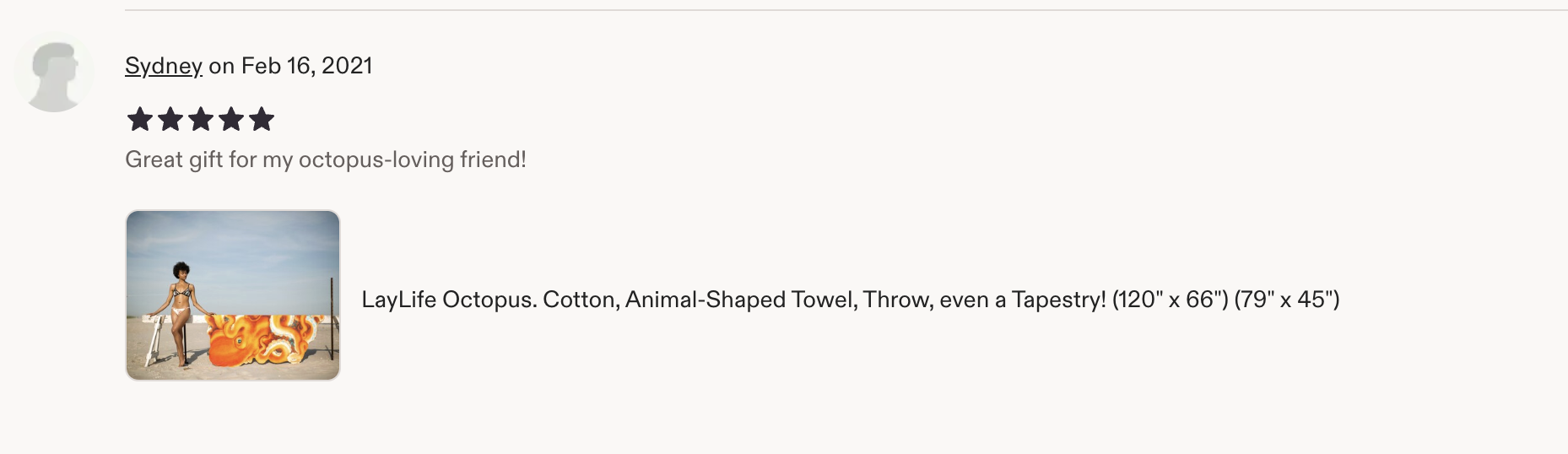
The project earned a 4.7-star Etsy average across 42 public reviews, with customers responding to the originality, scale, quality, and giftability of the pieces. A portion of sales also supported animal-focused causes, tying each product back to the creature that inspired it.
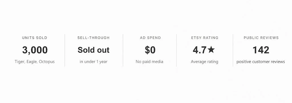
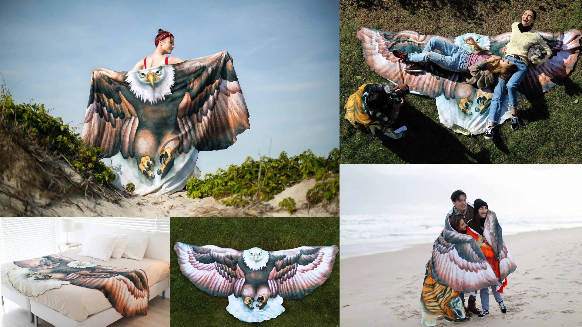
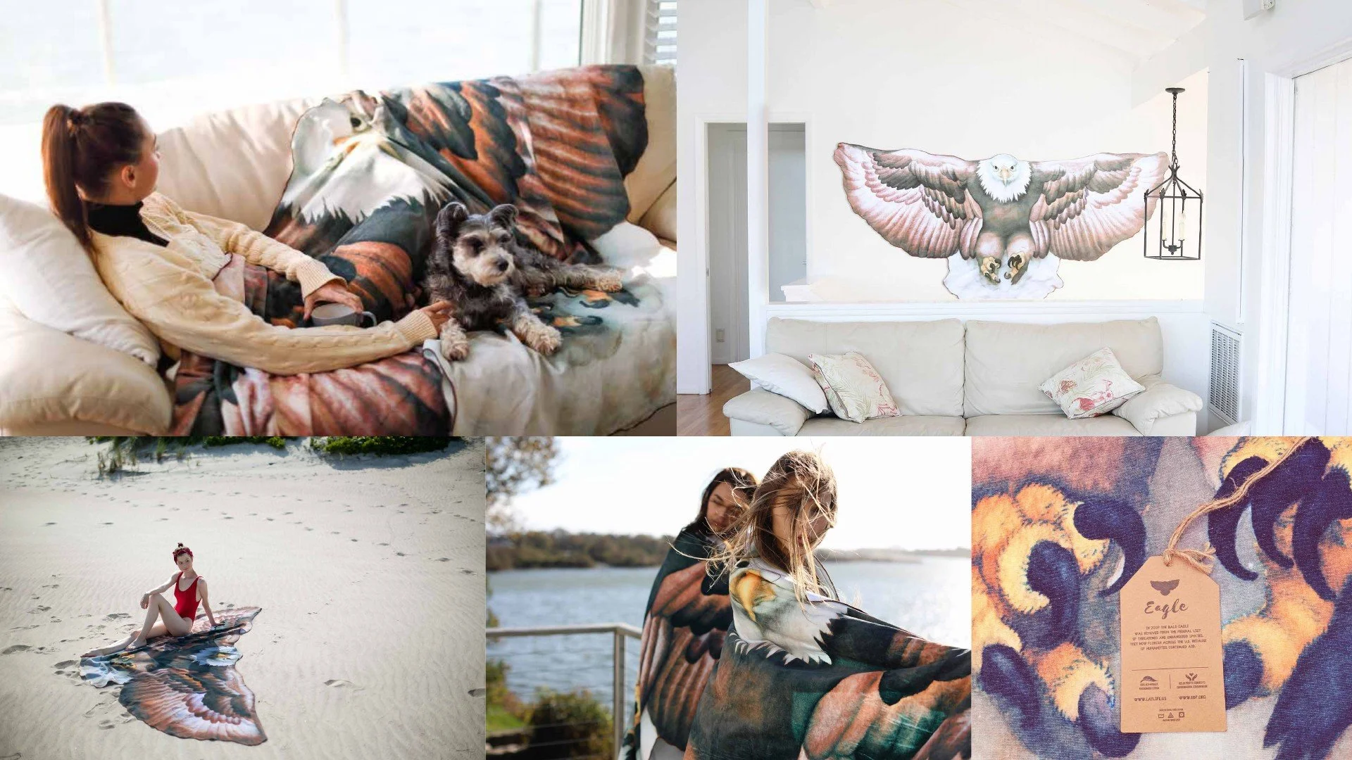
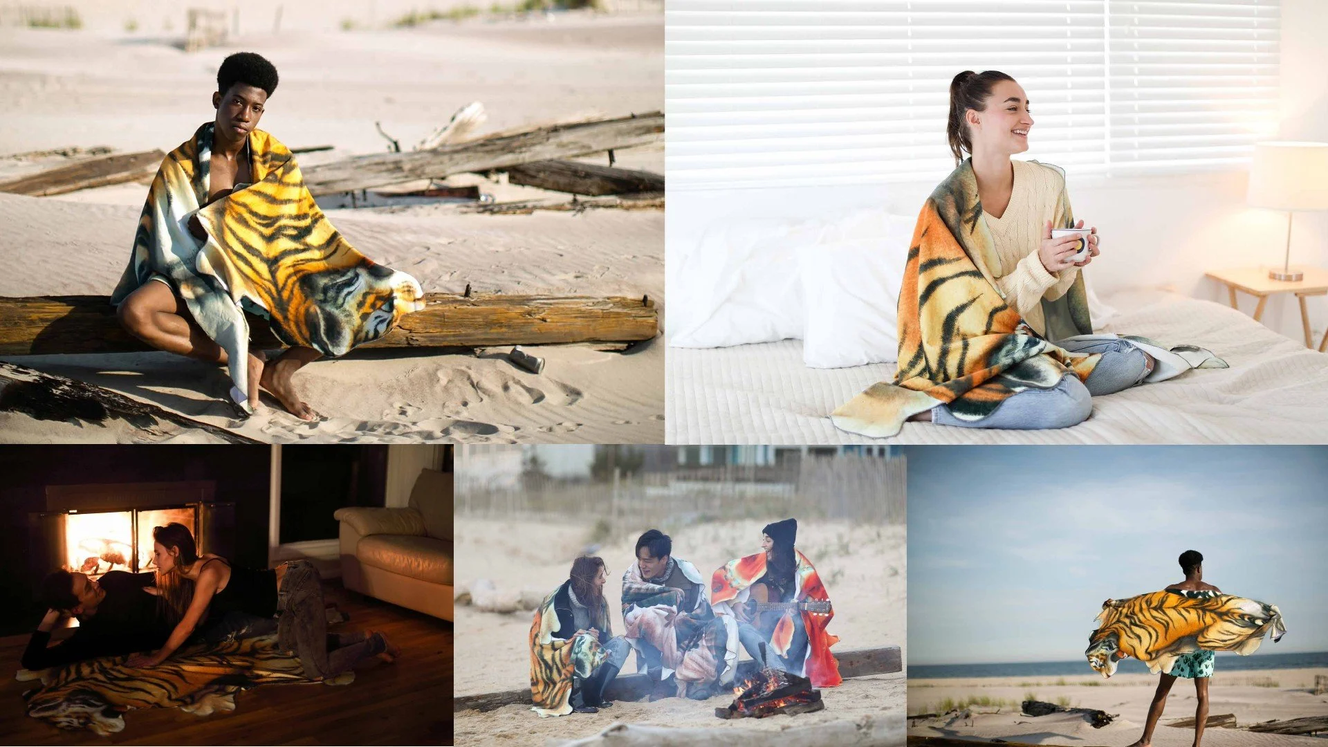
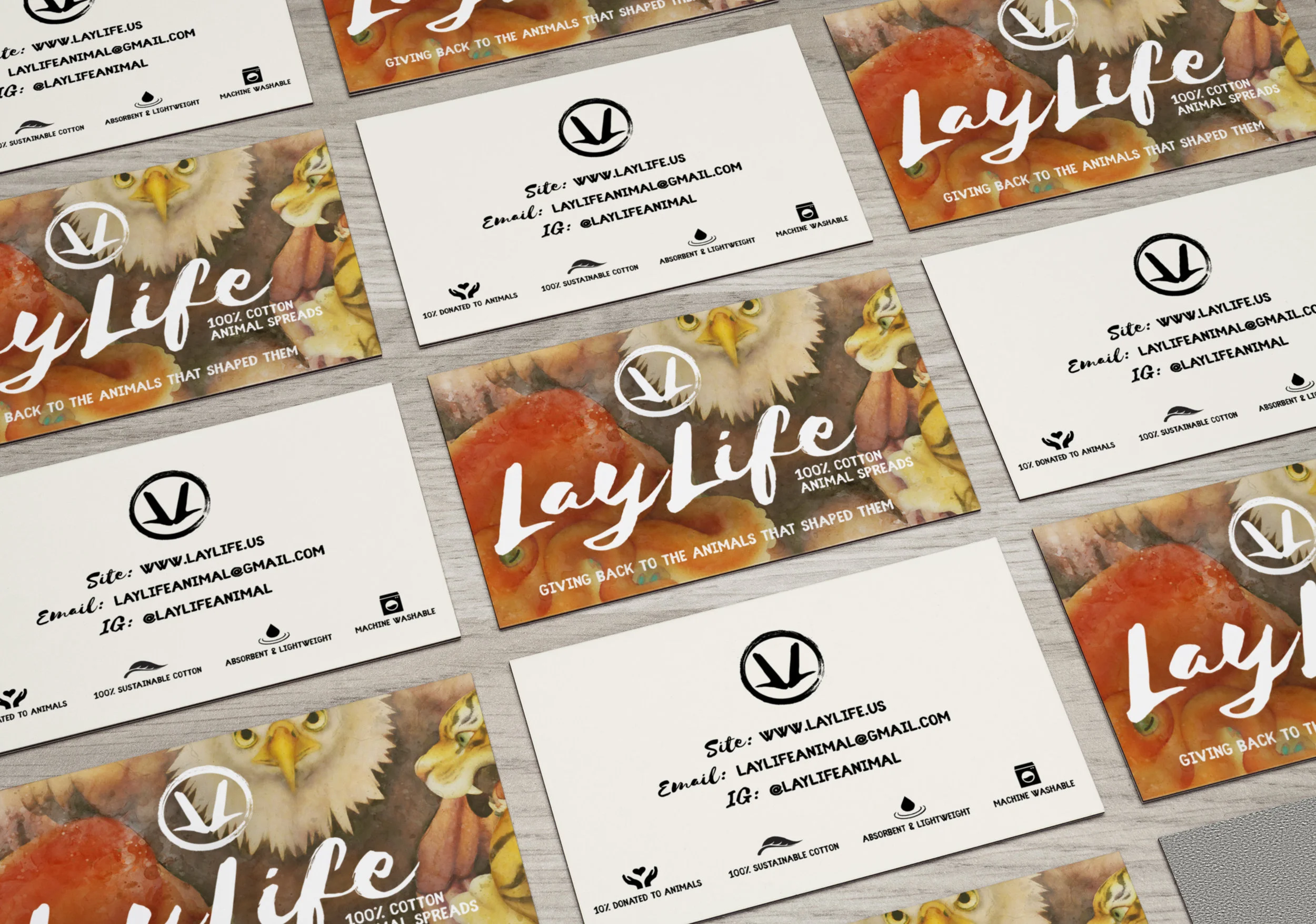
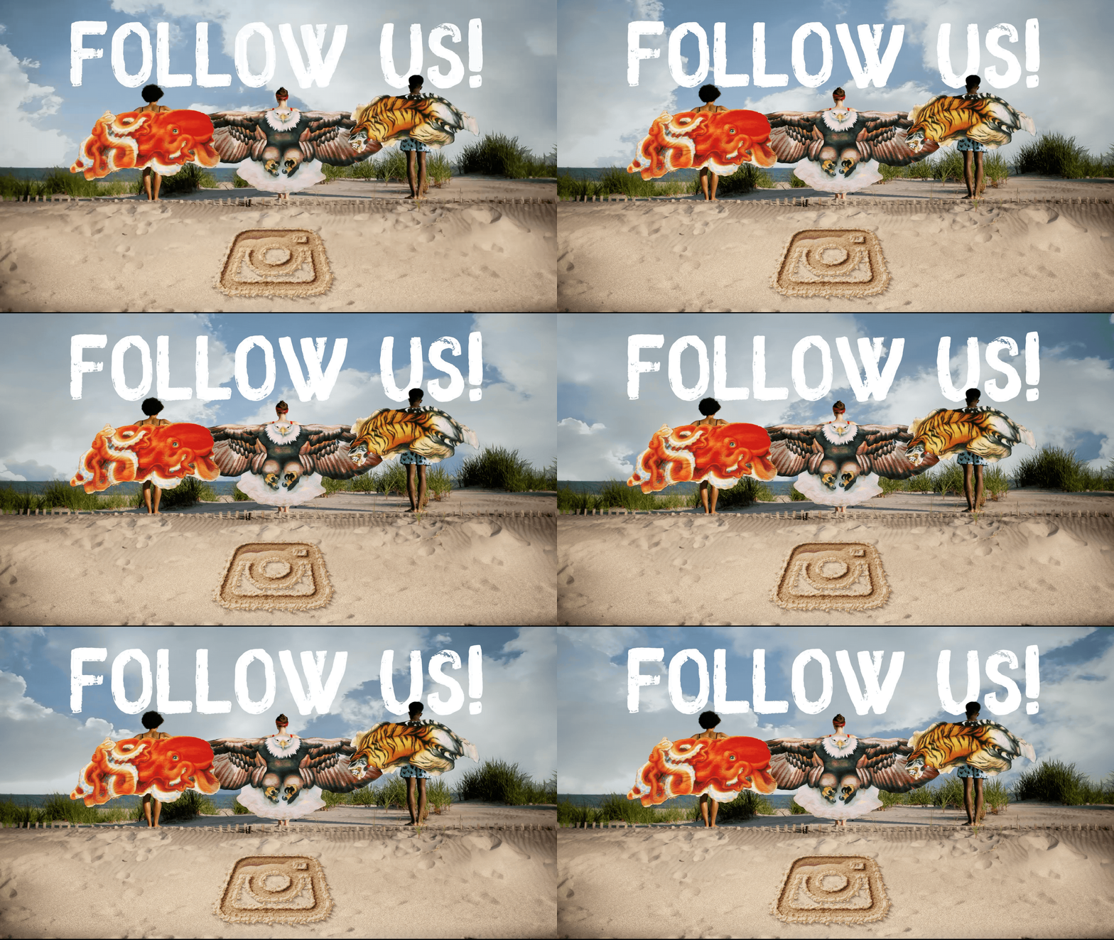
Leave Behind / Outreach Deck
TRI-HONDA
Created for the 61-dealer Tri-State Honda network, this year-long integrated campaign ran across TV, radio, and in-dealership media throughout the New York Tri-State area. Built around the region’s endless personalities, the work turned local attitude into a flexible platform for showcasing Honda’s feature lineup — delivering an estimated 250M+ regional impressions across broadcast, audio, and retail touchpoints.
:30 Tri-state Broadcast spots
This was an extra series of VO driven car feature ads.
X-BITE
2015-Present
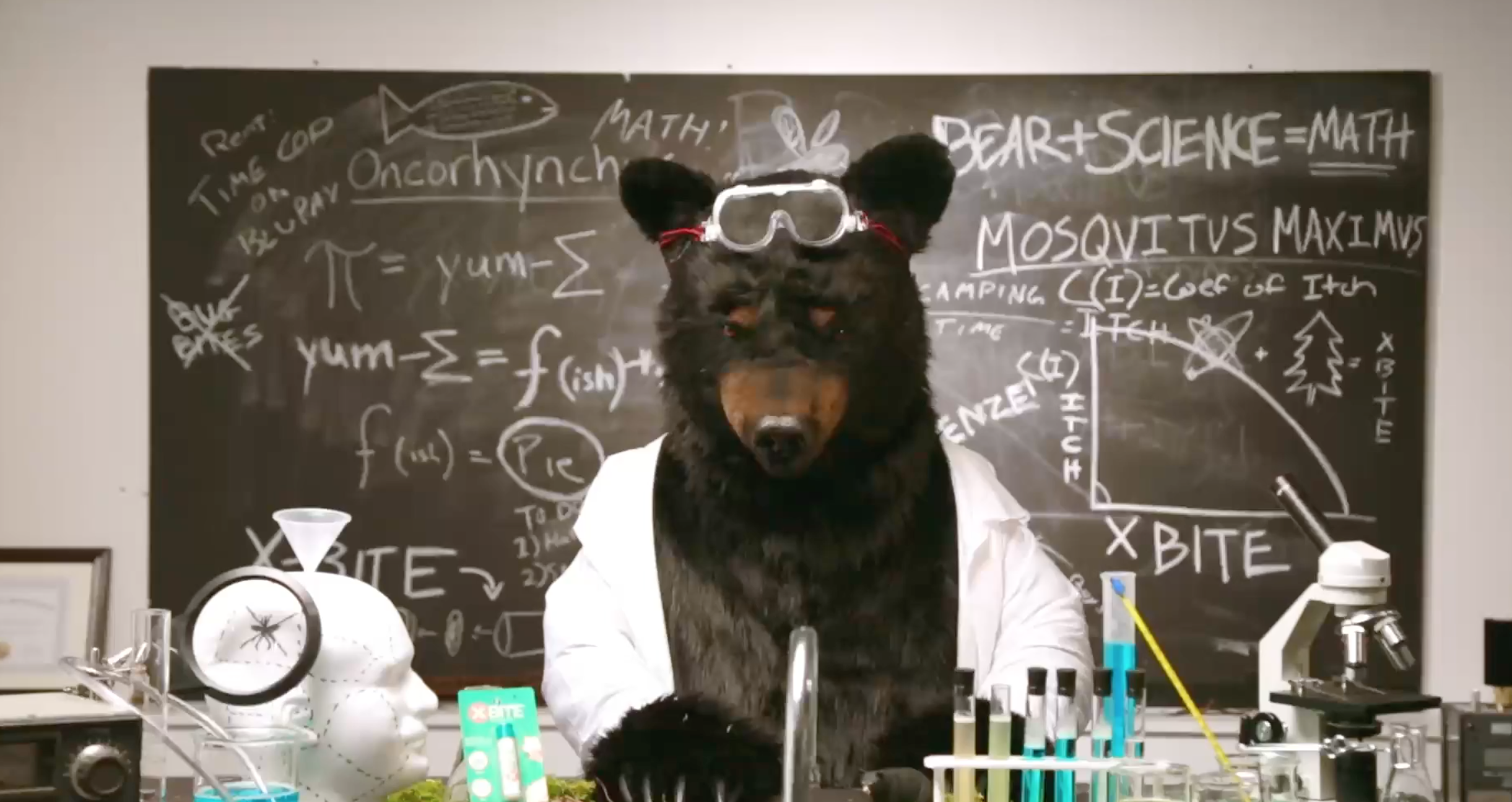
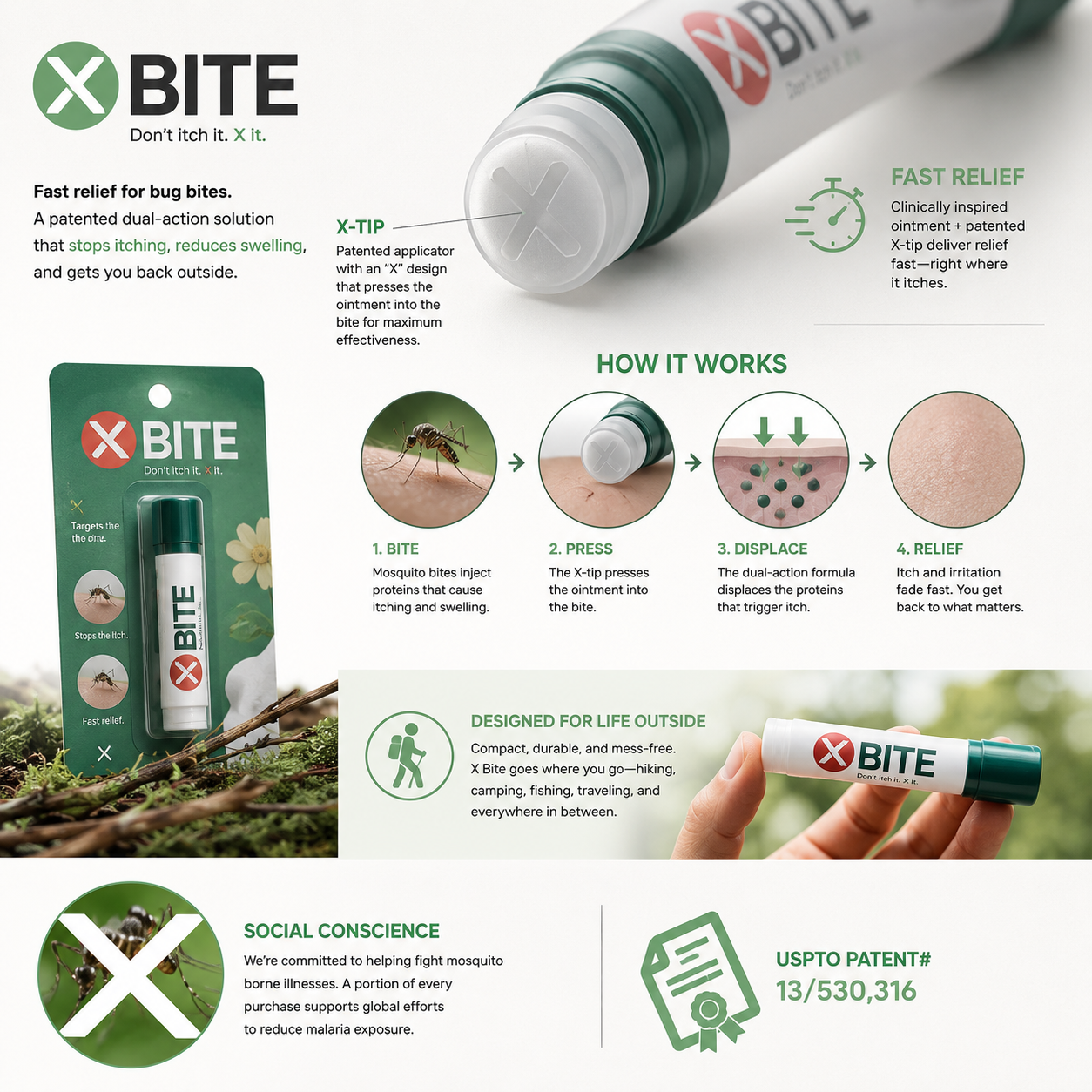
Three friends, one strange idea, and an Indiegogo video we produced in-house for under $2K — complete with a bear and a scientist. After years of development, patent work, prototypes, lawyers, meetings, and endless group chats, X-Bite became a fully USPTO-patented invention, the #1-selling SKU in its category, and ultimately landed a licensing deal with Adventure Ready Brands / Tender Corporation. Today, X-Bite with XTech is sold nationally through major retailers including Walmart, CVS, Walgreens, and more.
:90 Hero Video for web
HOW IT WORKS
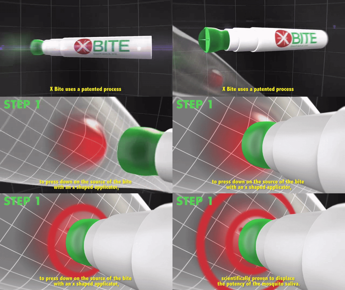
First, a patented "X" tip applicator is pressed into the bite - a scientifically proven method that displaces and weakens the potency of the insect's saliva.
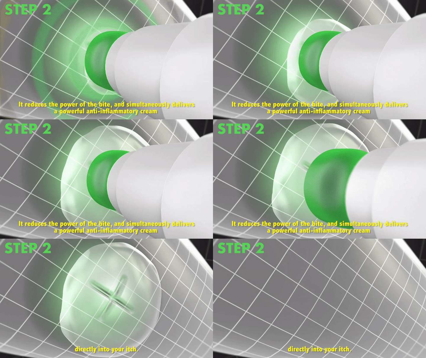
Simultaneously, a powerful antihistamine ointment is applied through the tip directly onto the bite, providing relief and speeding the healing process.
BMW
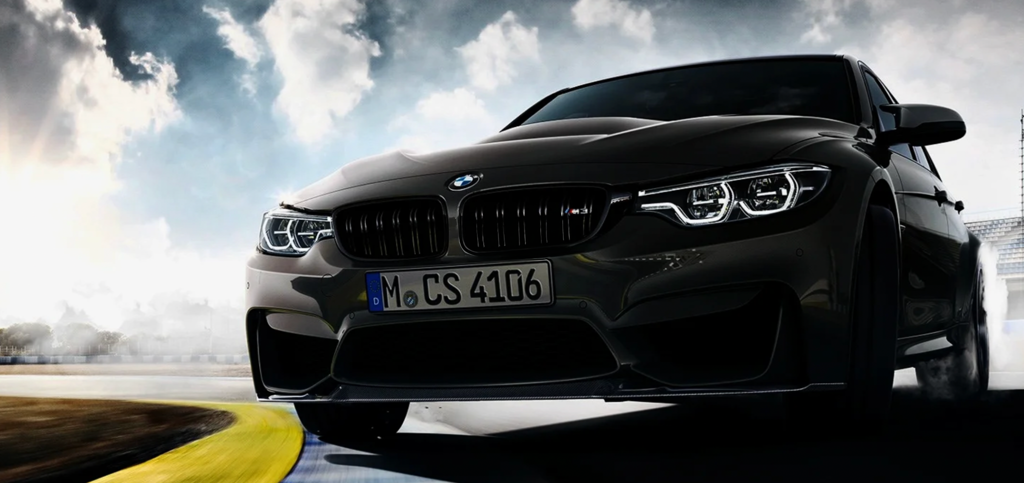
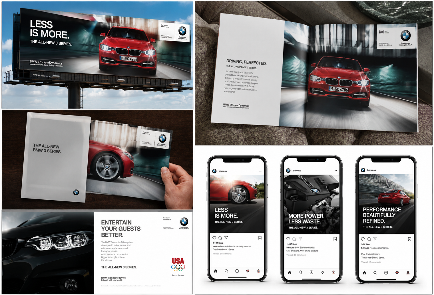
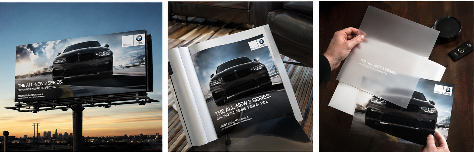
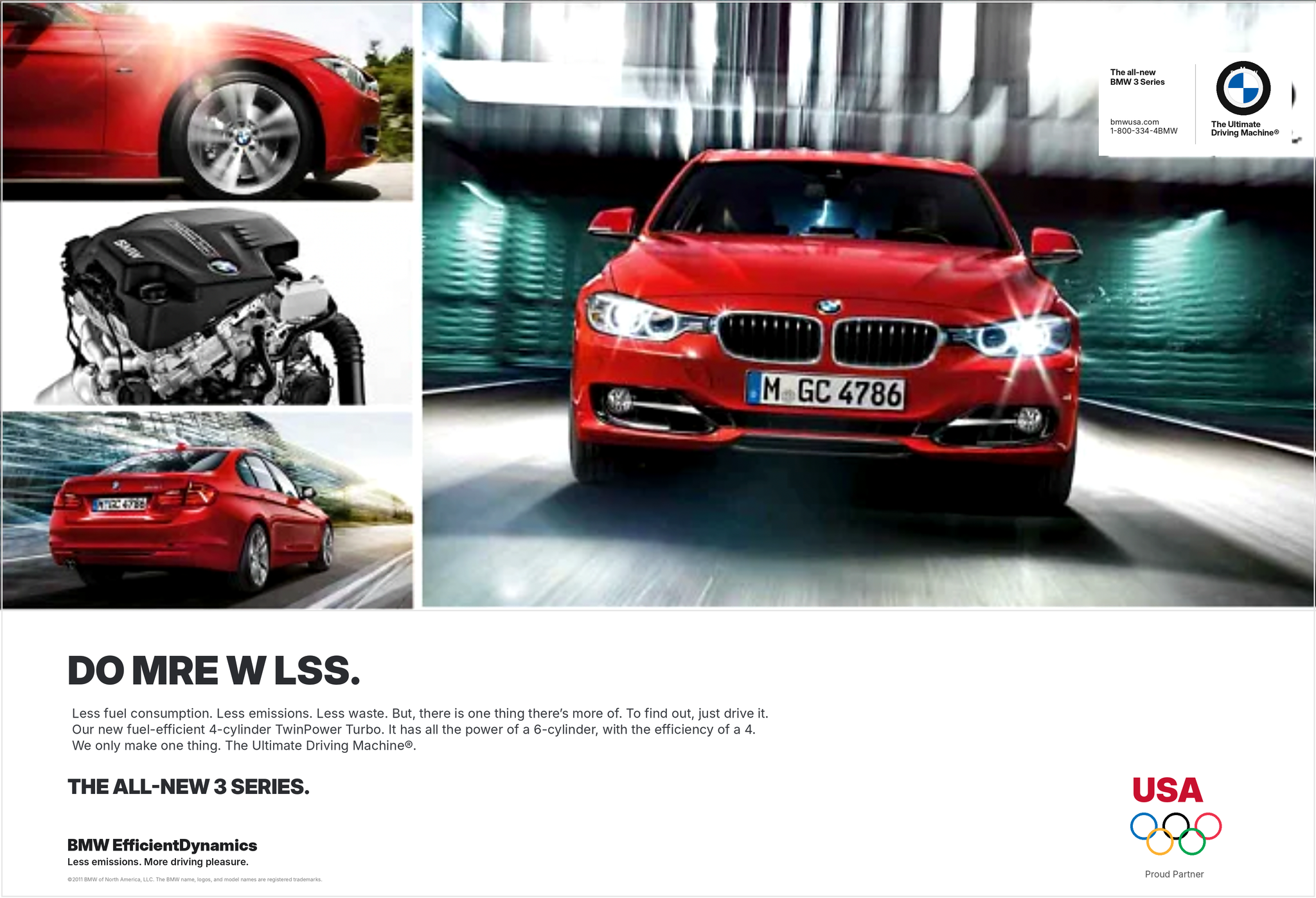
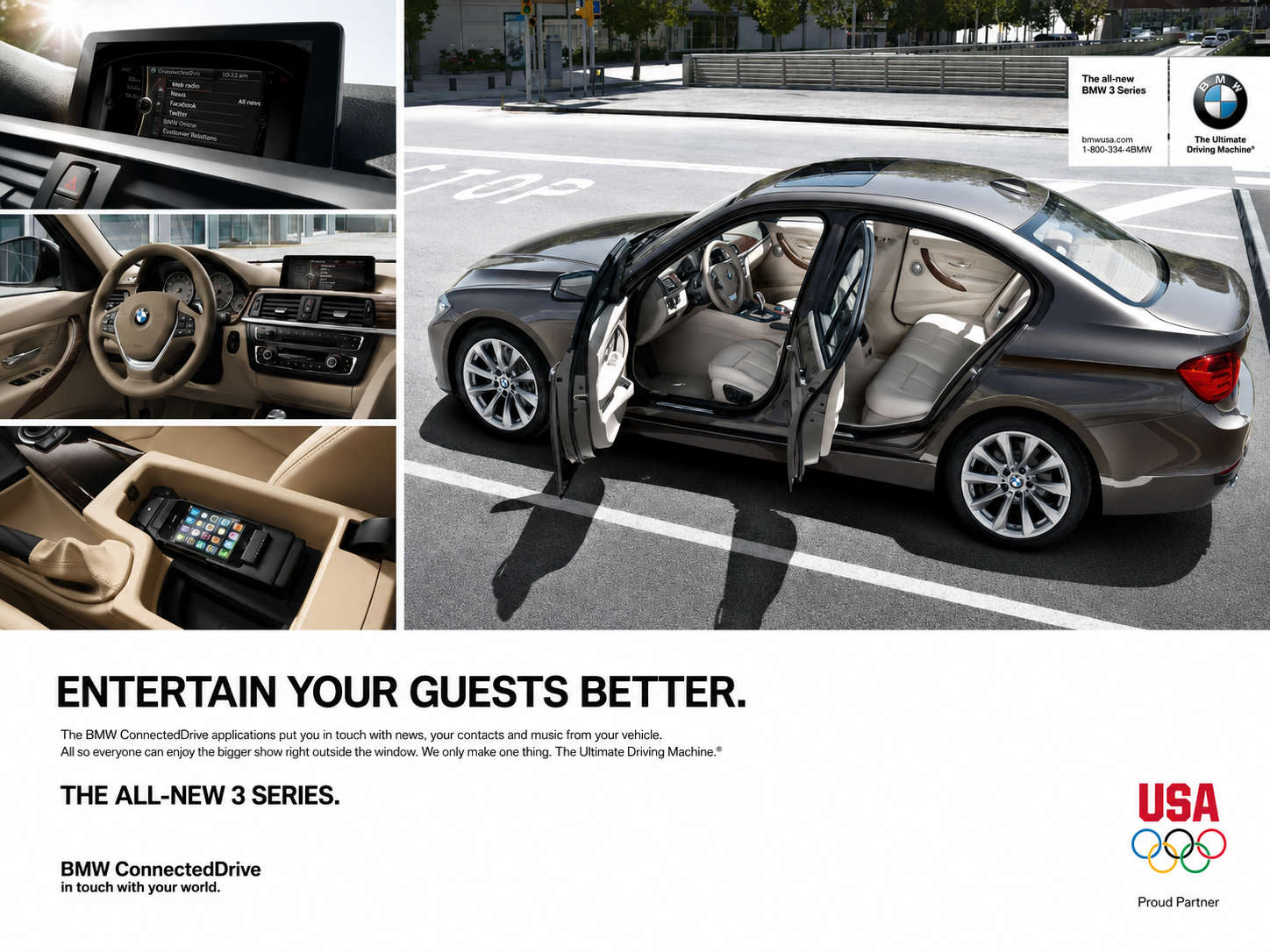
At KBS, I worked across a wide range of BMW campaign work spanning billboards, print, digital, social, and direct marketing. The challenge was to bring BMW’s performance, design, and premium brand language to life across every format — from high-impact outdoor placements to more targeted digital and direct-response executions. Each piece had to feel unmistakably BMW: clean, confident, precise, and built around the feeling that makes the brand iconic — the drive.
BIilboards / Direct Mail / Social / OOH
Print Ads
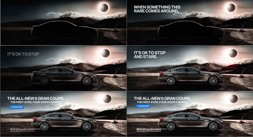
:60 Radio spots
Using a free online robot voice changer, we made a series of radio ads for the BMW 3 Series that showcased its ConnectedDrive features in a completely ridiculous — and somehow very effective — way. To this day, I’m weirdly proud of these spots.
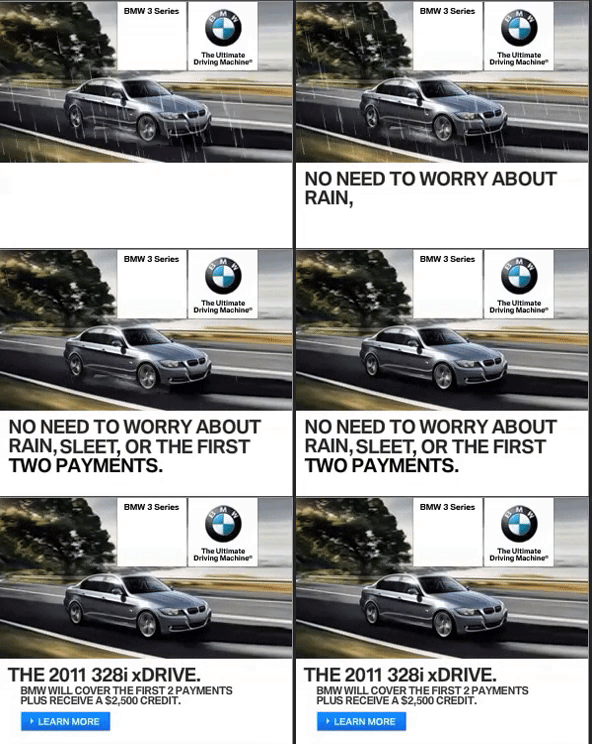
Banners ads
Banners
BIilboards / Direct Mail
SIMPLY ORANGE
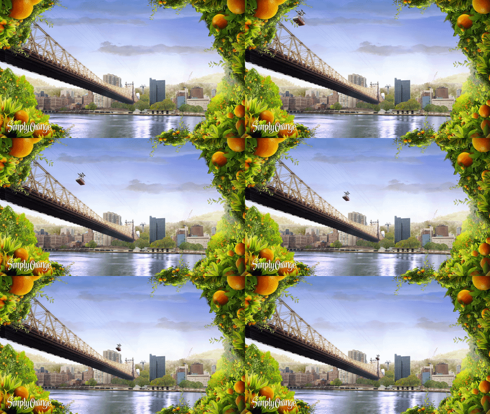
Gotham to Grove brought Simply Orange’s fresh, sunlit world into the middle of New York winter. Across cinemagraphs, animated banners, and carousel ads, orange groves overtook iconic NYC landmarks — bridges, skyscrapers, courtyards, and commuter corridors.
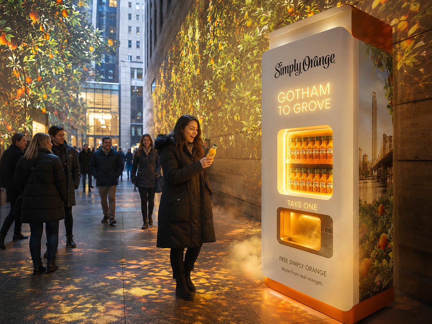
The idea also extended into a sensory street activation: a glowing Simply Orange vending machine that gave away free bottles, then filled the surrounding space with projected leaves, citrus scent, warmth, and golden light.
PRE AI Cinemagraphs for social media and paid



World Baseball Classic
(WBC)
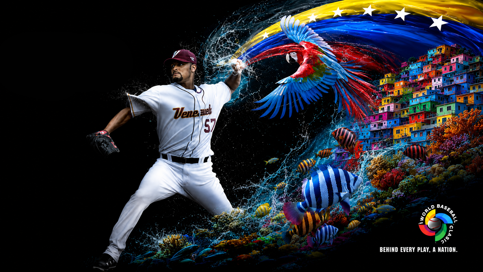
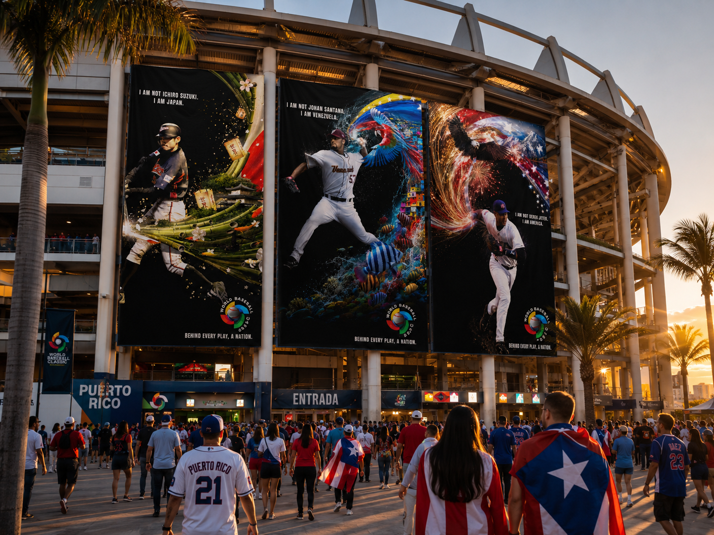
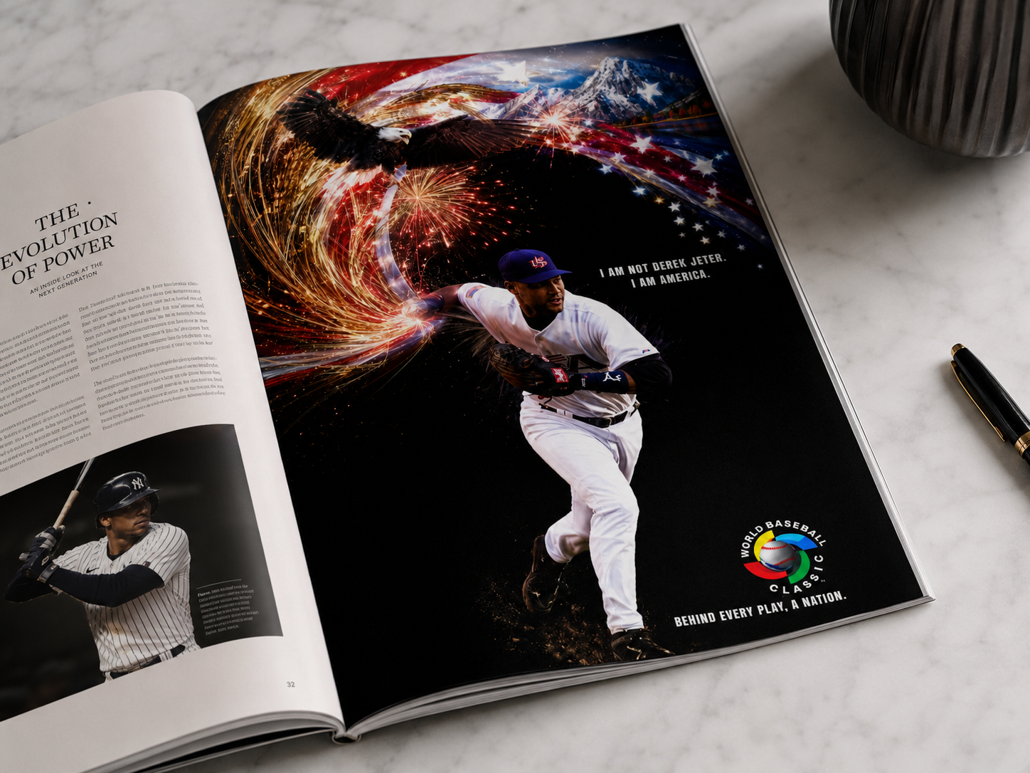
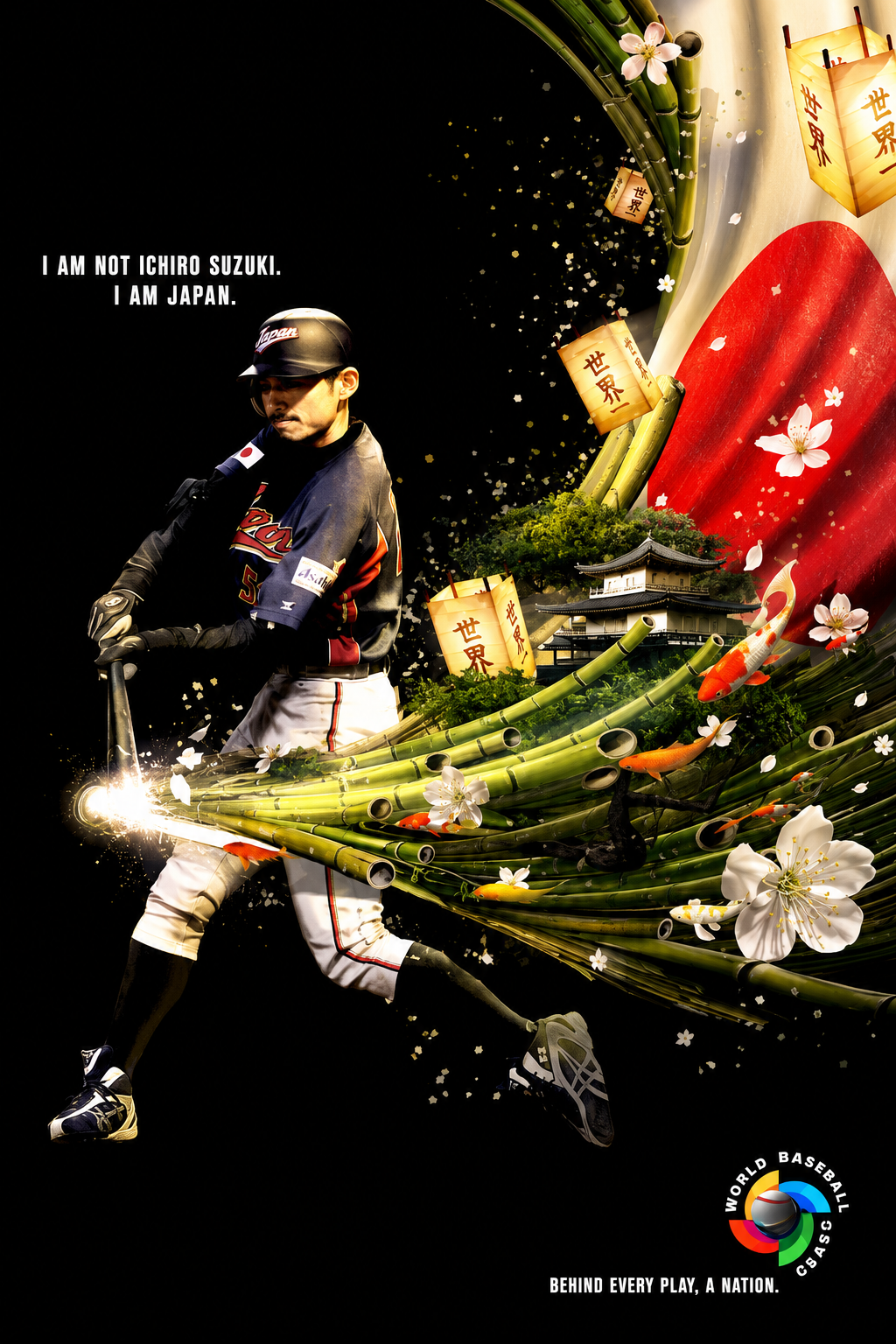
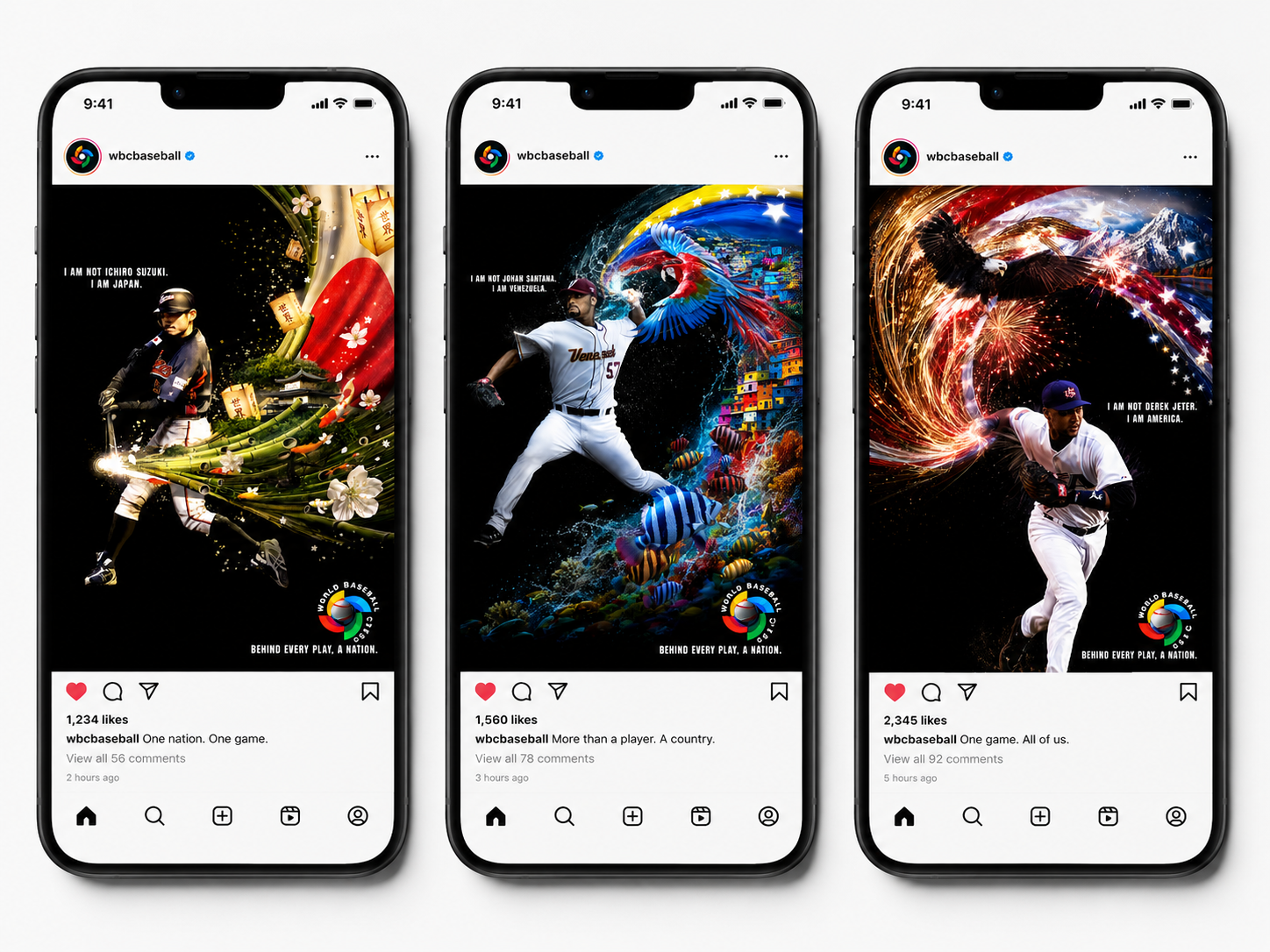
A three-ad print campaign created for Grey’s World Baseball Classic pitch, built entirely in Cinema 4D and Photoshop. The campaign won the business and later ran internationally. Each execution visualizes the idea that behind every hit, throw, and play is an entire nation. The players are shown as conduits for their countries, with the full force of their culture, landscape, symbols, and spirit pulled into the action itself. Japan, Venezuela, and the United States each come alive through iconic national imagery that surges through every movement, turning individual athletic performance into an expression of collective identity. The result was a visually dense, high-energy campaign that framed the tournament not just as baseball, but as national pride in motion.
Original Prints that won the new business
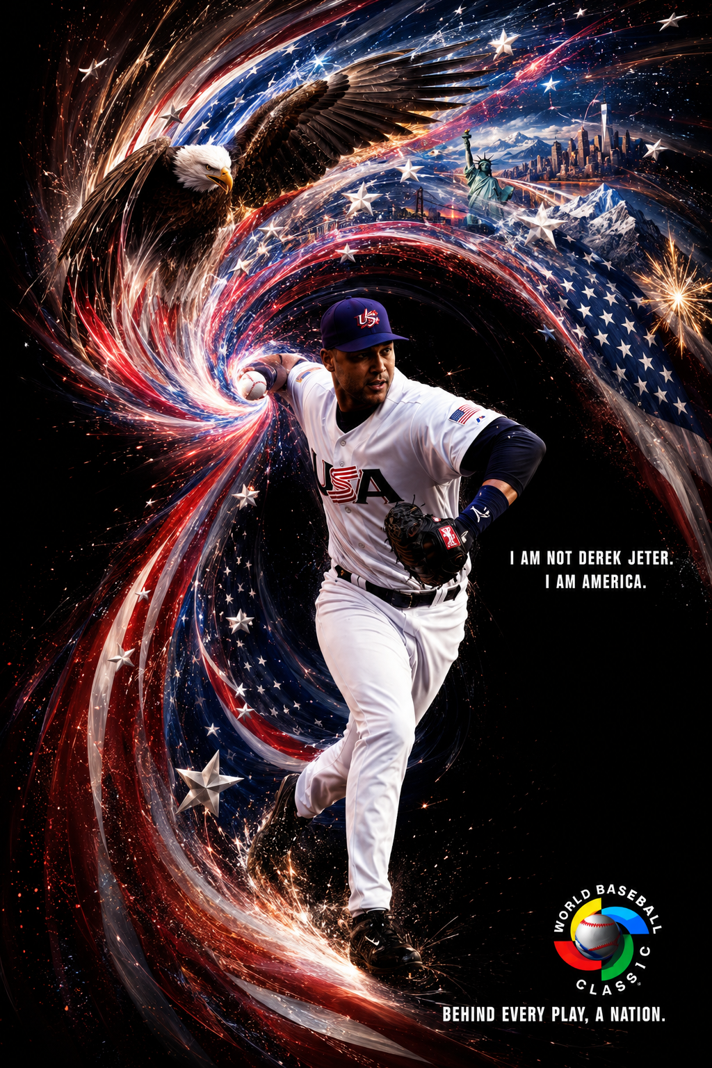
Magazine Print
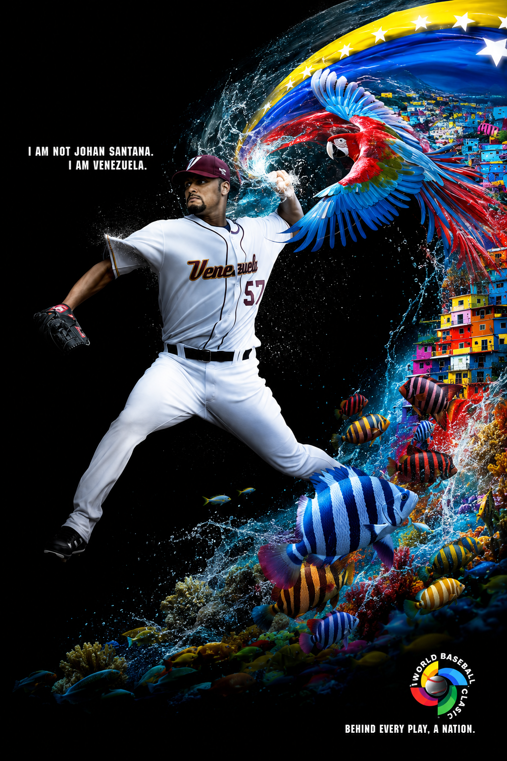
Social Posts
Stadium Banners
Select Design
Ad Age Cover Contest
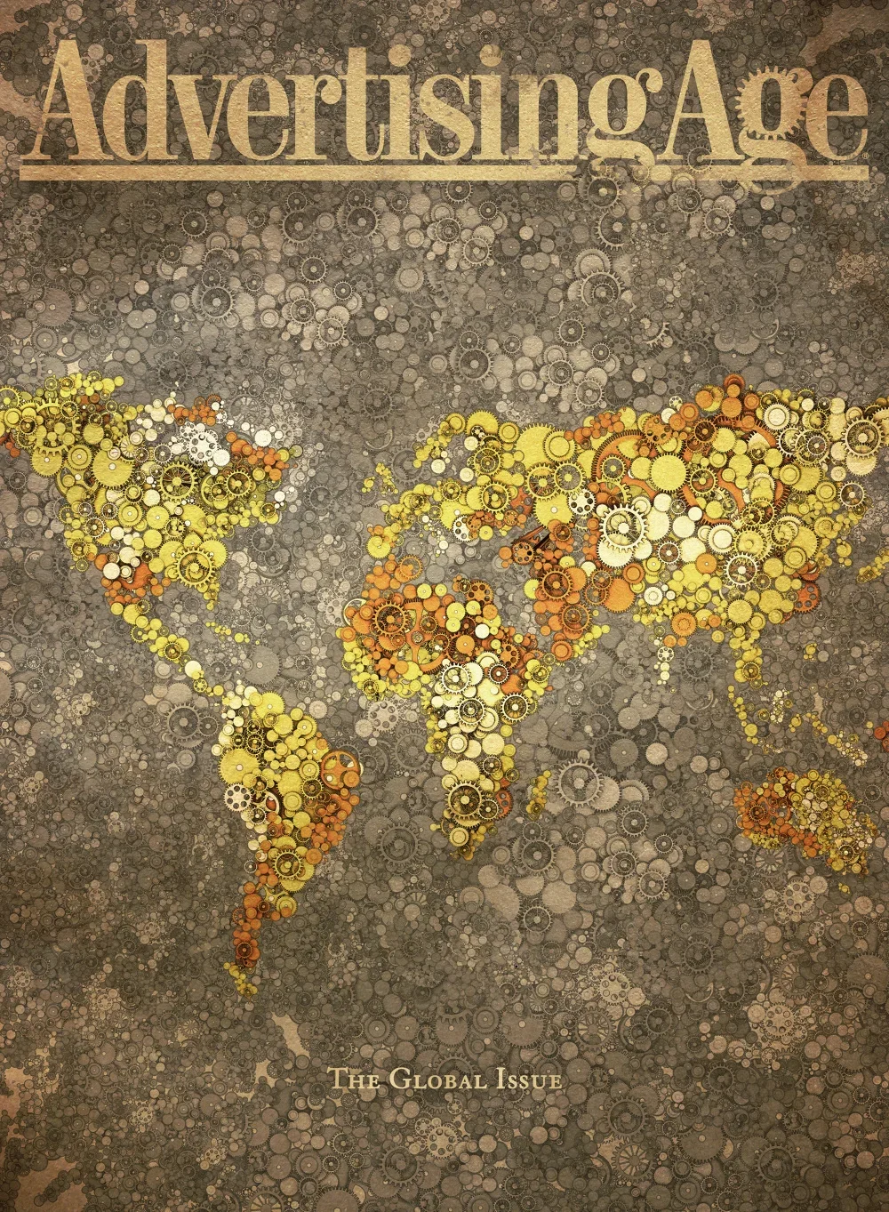
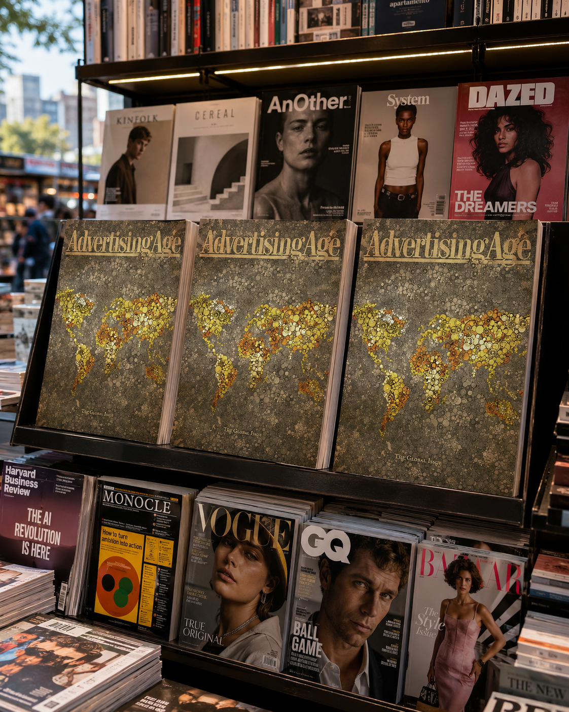
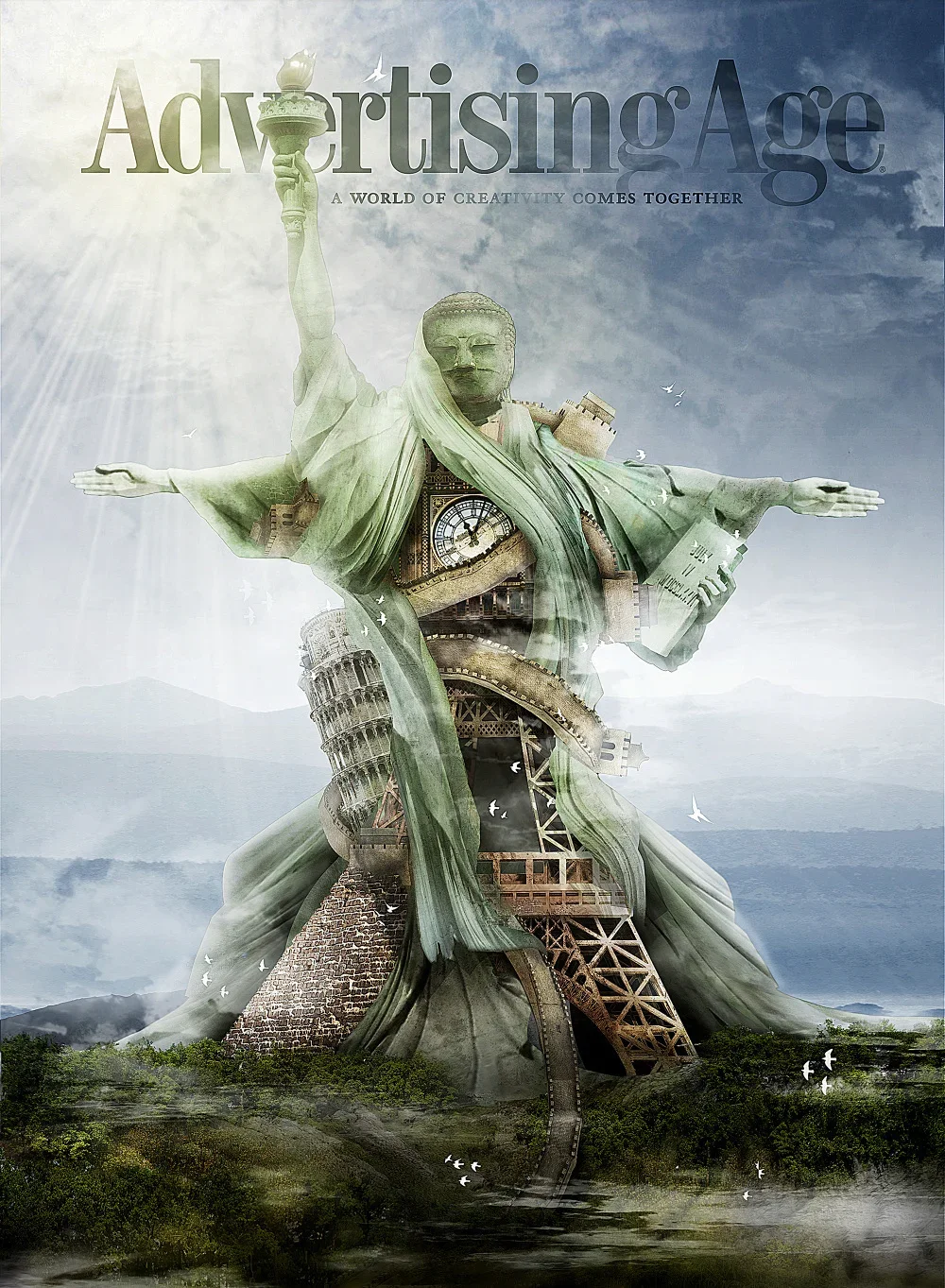
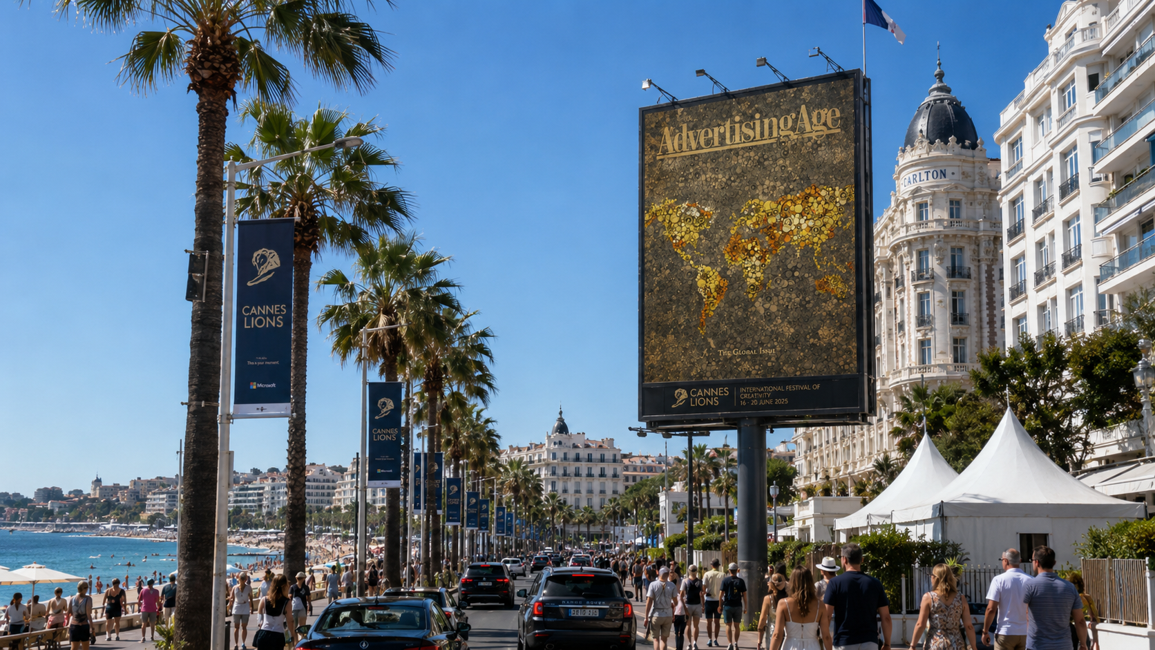
This cover won the Ad Age Cover Contest and was featured as a massive billboard on Boulevard de la Croisette during Cannes Lions. A second concept from the series, built from mixed cultural monuments and global iconography, also took second place. The win led to an invitation to Cannes, where we gave a talk, hosted an event, and saw the work installed at the center of the festival.
Winning cover
According to Adage, I also won second with this one.
Dannes Lions
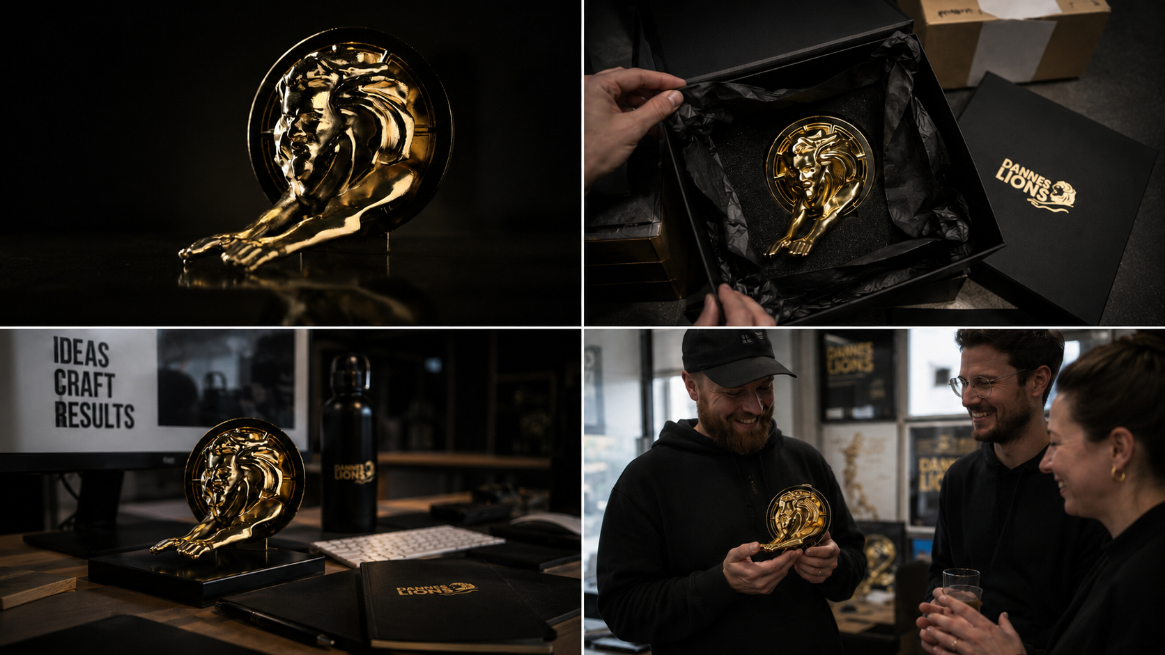
A parody award made for Director Dan Sheppard’s independent creative show, Dannes Lions.
Instead of making a standard trophy, I sculpted a custom lion in ZBrush with Dan’s actual face worked into the form, turning the Cannes Lions icon into something more personal, ridiculous, and weirdly prestigious. The final pieces were 3D printed, finished in faux gold plating, boxed, and shipped to winners as real physical awards.
What started as a joke became a fully produced object: part sculpture, part branding system, part industry prank. A fake award that felt just real enough to make people want one.
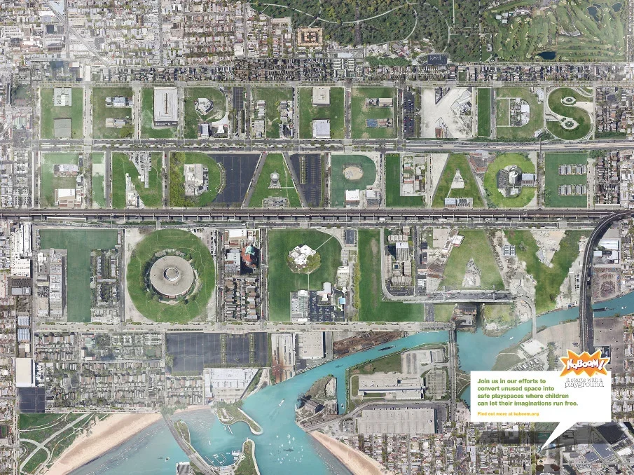
KaBOOM! Young Lions Submission
A Young Lions print submission for KaBOOM!, a nonprofit focused on creating safe places for kids to play in underserved urban communities.
The idea was to turn the city itself into the message. I built the image by painstakingly collaging satellite screenshots from Google Maps, carving parks, playgrounds, fields, streets, and empty urban lots into the headline: Give kids a place to play.
The final piece was produced as an ultra-high-resolution six-foot print, designed to reward both a quick read from across the room and a closer inspection of the construction. From a distance, it worked as a simple headline. Up close, it revealed the labor behind it: hundreds of map fragments rebuilt into one impossible city made entirely for play.
We didn’t win, but the piece placed, and it remains one of my favorite examples of turning a media constraint into the idea itself.
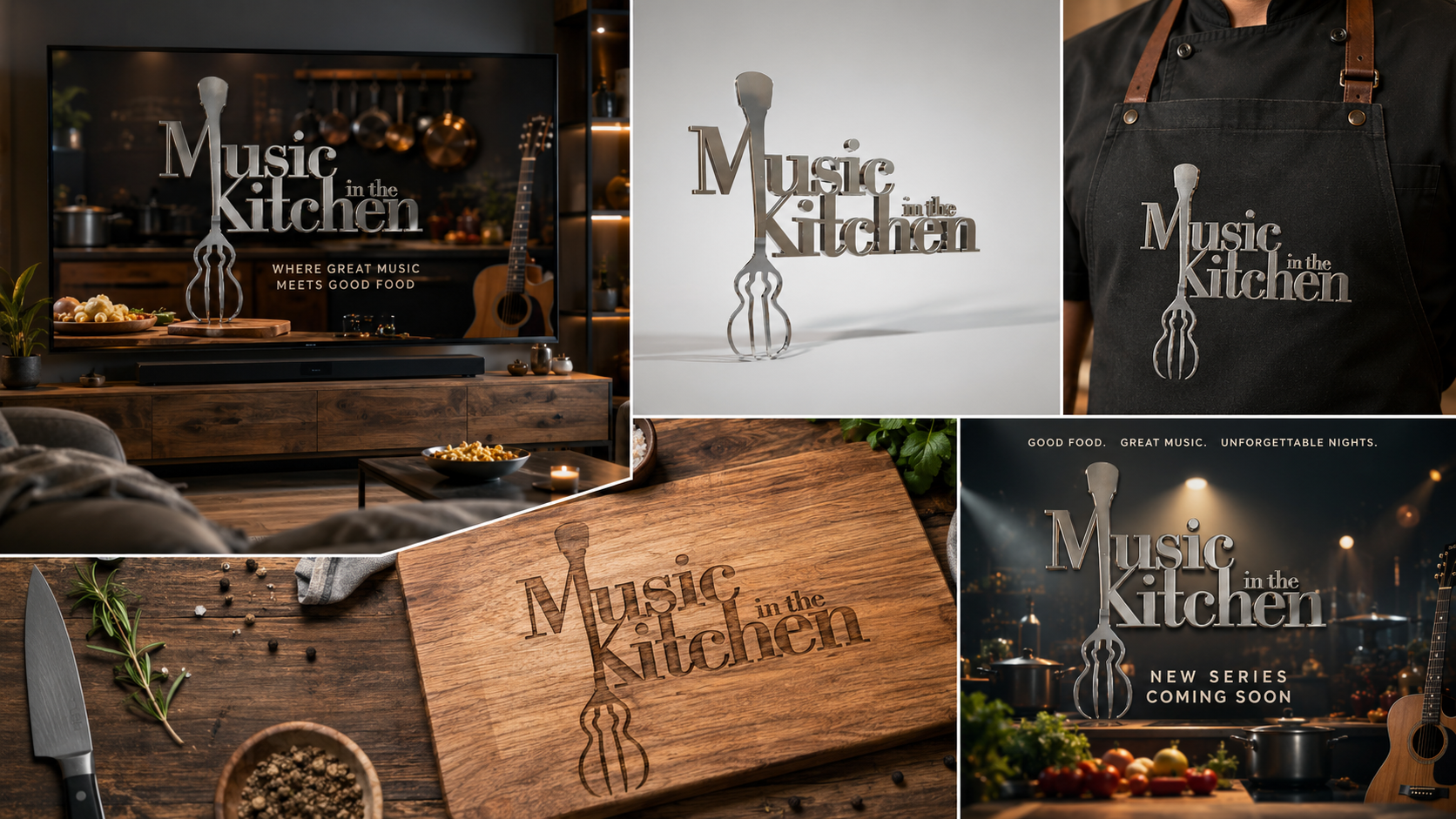
Music in the Kitchen
Logo and identity work for a pilot concept built around the connection between food and music.
The show paired original songs with original dishes, turning each episode into a kind of creative jam session between the kitchen and the studio. I designed the title treatment around that same idea, blending a fork and guitar into one simple mark.
The result was a dimensional logo that felt both culinary and musical, with enough polish to work as a show title, trailer card, set graphic, merch, and pitch material. It was a small identity project, but the visual idea carried the whole concept instantly: sound, taste, and craft coming together in one mark.
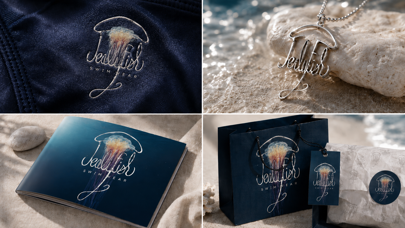
Jellyfish Swimwear
Hand-drawn logo and identity work for Jellyfish Swimwear, a women’s swimwear concept designed around subtle built-in lift.
The product used thin silicone padding in the bust and seat to shape the body without making the suit feel bulky or obvious. I wanted the identity to feel just as fluid: elegant, minimal, and a little sensual without being too polished or generic.
The logo was drawn entirely by hand, with the wordmark forming the body of a jellyfish. The top stroke becomes the bell, while the long descending flourish acts like a trailing tentacle. It gave the brand a mark that could live on the suits themselves, packaging, jewelry, tags, and printed collateral.
A simple piece of lettering became the whole system: ocean-inspired, feminine, and built around the same idea as the product itself — natural shape, subtle lift, and movement.
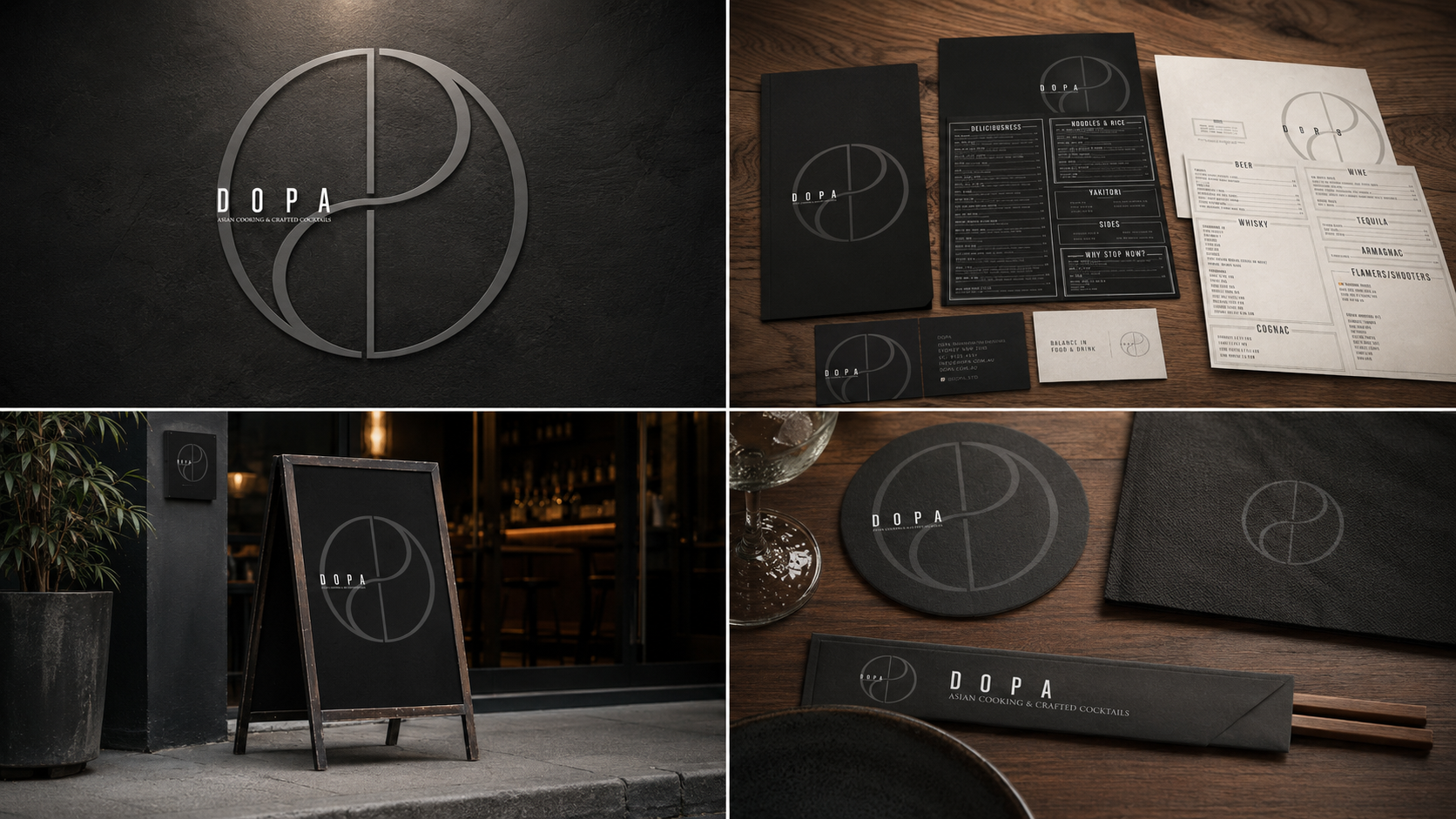
DOPA
Identity and collateral for DOPA, an Asian restaurant and cocktail bar built around balance.
The mark was designed by layering the letters D O P A into a single circular symbol. Together, the forms create a subtle yin-yang, tying the name directly to the restaurant’s core idea: balance in food, drink, flavor, and atmosphere.
That system carried across the full restaurant identity, from menus and business cards to signage, coasters, chopstick sleeves, and exterior boards. The palette stayed restrained: black, charcoal, warm wood, and off-white, giving the brand a quiet, elevated feel without losing the warmth of the restaurant.
A simple monogram became the entire visual language: elegant, minimal, and conceptually tied to the experience of Asian cooking and crafted cocktails.